

A responsive WordPress theme is a theme build to adapt with the purpose of giving tablet and smartphone users a great experience. This without maintaining multiple websites and multiple sets of content! For some time dedicated WordPress mobile themes was the best option, but recently responsive WordPress themes have been all over the place. There is no doubt that responsive web design is the new hot trend and so it is to use responsive CSS frameworks to implement the responsive layouts. With the rapid growth in number of smartphones and Internet enabled gadgets being sold world wide, it is time to take mobile web design serioust and ensure that your blog or business website is ready. WordPress themes with responsive layouts makes this possible and at a reasonable cost.
Having a responsive web design allows your website content to be displayed correctly to all users by adjusting the layout to accommodate screens of different sizes and orientation. The cool thing about responsive themes is that they allow you to maintain one theme and provide one consistent look and feel no matter how visitors access your website. In many cases responsive web design themes simply takes away the need for mobile versions of websites. More themes that are responsive arrive every day now but still it can be difficult to find the right one. I have collected some of the best responsive WordPress themes here to help you get started. To help you find what you are looking for faster I have categorized the themes into the following sections: Build in custom responsive layouts, Twitter Bootstrap based themes, Skeleton framework themes, Zurb Foundation, 360.gs and starter themes.
The trend now seems to be either creating custom fit for purpose responsive layouts or using Twitter Bootstrap. The availability of cool Bootstrap website templates and Bootstrap WordPress themes is simply amazing and more is released every day. However, I added a broad selection of responsive themes in case you want to use a specific framework or to start with a clean starter theme.
For testing responsive layouts and tuning you should check out some responsive web design tools. It is a good idea to test the responsive implementation using the theme preview before deciding to use a specific theme. Some themes simply have better responsive design than others.
This article is continuously updated with fresh responsive WordPress themes! Please leave a comment and share the article.
Disclosure: Please note that some of the links below are affiliate links and I will earn a commission if you purchase through those links (at no extra cost to you). I recommend that you do your own independent research before purchasing any product or service. This article is not a guideline, a recommendation or endorsement of specific products.
[exec]$filestr = file_get_contents(‘http://www.tripwiremagazine.com/googleadsensebelowmoretag.inc’);echo $filestr;[/exec]
Index
- WordPress Themes – Custom Responsive Layouts
- Reponsive Bootstrap WordPress themes
- Skeleton Based WordPress Themes
- Zurb Foundation based WordPress themes
- WordPress Themes using 960.gs – Unsemantic
- Free Responsive WordPress Theme – Starter and Frameworks
WordPress Themes – Custom Responsive Layout
The themes below are all designed and implemented to be responsive and to give mobile users a great experience. Please check the demos to ensure the responsive design fits your needs and that the required dimensions look good. One way to do this fast simply is to make the browser window smaller. Best solution however is to test on a tablet and smartphone before making the final decision. Keep in mind that responsive WordPress templates required a lot of effort to design, implement and that maintenance may be quite a job as well. You see, every screen size with a unique layout and this require some extra design and implementation why many areWordPress themes with a simple and minimal design, without too many elements to manage.
Incentive – Responsive All-Purpose Theme – MORE INFO
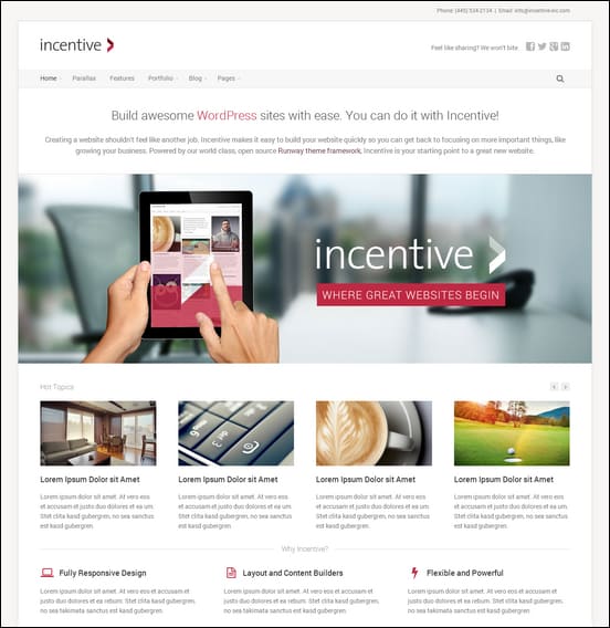
Incentive is a great responsive WordPress theme designed for business websites, but it is a milti-purpose theme with many useful features. You will be able to set business websites, online portfolios, blogs and so much more using Incentive. The theme has been build using the Runway Framework and it is therefore very flexible and comes with a versatile design.
Lucid WordPress Responsive Theme – MORE INFO

Lucid is a responsive multi purpose WordPress theme for blogs, magazines and more- I think Elegant Themes did a great job with the design of Lucid. It features a modern magazine layout that allows you to have a busy website with lots of content. The layout is responsive, clean and minimalistic. ElegantThemes provide a page builder for their themes that will give you full control of your page layout and content. Check it out here
Ace — Responsive All Purpose WordPress Theme – MORE INFO

Ace is a responsive template with a design covering formats from 320px (tiny) to 1920px (widescreen). The theme comes with a clean and simple design but offers tons of useful features to build various types of websites. The gallery and portfolio functions will do wonders for a portfolio website and the premium sliders and the WooCommerce integration makes Ace cool for a business and ecommerce website as well.
Spectro – Responsive Multi-Purpose Theme – MORE INFO

With Spectro you can get a powerful WordPress business template with a clean and simple design. Behind the minimal design you will find tons of building blocks to create a cool website such as 4 sliders plugins, 9 custom templates, 24 portfolio combinations, light and dark design styles, 35 shortcodes and much more.
DeepFocus – MORE INFO

With Deep Focus you can turn your WordPress business website into a responsive business website and online photo gallery. Along with the gallery layout, DeepFocus comes with a robust blog and CMS-style homepage as well, making it an amazing solution for artists/photographers looking to build an online presence. This is a great pick among the many Simple WordPress Themes available. Elegant Themes also have a huge set of other good looking and among best WordPress themes. Their gallery is worth checking out if you are looking for a new theme – you can get all 76 themes for $39.
Glamour Fully Responsive Magazine Layout – MORE INFO

Glamour is a responsive magazine theme for WordPress that adapts nicely to different view port sizes. The theme takes minimalism for complex magazine websites to the next level, but a splash of color. Glamour offers a multiple column post display and gives you great ability to customize the look and feel. I think it is a great choice for bloggers who want flexibility, speed and elegant minimalism.
Appdev – Mobile App Showcase WordPress Theme – MORE INFO

AppDev is a responsive one page theme designed specifically for website that promote mobile app development professionals and products. The theme includes some really cool visual features such as parallax scrolling effects, smart tracking lava lamp menu. Also included in AppDev is 100+ shortcodes and visual generator, portfolio feature, mailchimp widget, 4 color schemes, 500+ icons and more.
Flexible Responsive WordPress Portfolio Theme – MORE INFO

Flexible theme is responsive as well as image centered as it uses grids in displaying the images. Clean and simple design makes it stand out. The theme puts your work first, keeping the design elements to a minimum while still maintaining a definitive modern style. With its filterable, ajax-powered multi-media gallery, Flexible is perhaps our most feature-rich gallery theme yet. Even on smallest devices this responsive theme looks great.
Boxline – MORE INFO

Boxline is an elegant responsive blog and magazine theme for WordPress. It is minimal and clean with a combination of subtle, soft grays, light textures and a few bright colors.
Resizable responsive theme – MORE INFO / DEMO

Theme Junkie is showing off their skills with this first responsive WordPress template. It is a cool magazine / news theme layout and the responsive design is pretty cool, especially with the sub menu moving to the left as the viewport gets smaller. The Resizable theme works great on any resolution on desktop and mobile devices such as iPad, iPhone, Android, and Blackberry.
Renova – MORE INFO / DEMO

Renova, a unique and very different single column theme for WordPress. The main design of renova is concentrated on a minimal style dedicated to those writers who need a simple layout without any kind of useless stuff. Renova is responsive and was designed to perform well on the principal touch mobile device and tablets.
Yoko – MORE INFO /DEMO

Yoko is a flexible HTML5/CSS3 WordPress theme. With the responsive layout based on CSS3 media queries, the theme adjusts to different screen sizes. The design is optimized for big desktop screens, tablets and small smartphone screens.
Maxx – Responsive Creative WordPress Theme – MORE INFO

With Maxx WP you get a modern clean and creative theme with responsive layout. It is suitable for corporate business or portfolio. It use latest techniques : HTML5 and CSS3 . The theme have full responsive design and it means it will fit any device (Desktop, tablet, smartphone…), completely optimized for your touchable device. Maxx has everything you’ll want for your business website.
Responsive Bootstrap WordPress themes
The Twitter Bootstrap framework is one of the most widely used CSS frameworks. It is built with the most comprehensive list of features and can be quickly customized for each individual project. With the 12 column responsive grid introduced in Bootstrap 2.0 it became one of the most popular choices for WordPress developers. Bootstrap is probably the most popular CSS framework right now and there are so many cool Bootstrap website templates you can choose from at the moment.
Flavor – Responsive/HD Magazine/Review AJAX Theme – MORE INFO

Flavor theme is a responsive news magazine theme built on Bootstrap that’s both stylish and functional. Great website for including multimedia content.
RapidNews – Responsive Bootstrap Magazine Theme – MORE INFO / DEMO

RapidNews is a feature-rich WordPress magazine theme. Great for magazine , review, news and blog sites, with integrated reviews, video, slideshows, galleries and ADS system in each post.
CrossRoad – Responsive WordPress Magazine / Blog – MORE INFO

CrossRoad is a Responsive WordPress Theme, best suited for Magazines, News and Blogs. It comes with 18 awesome widgets and 22 widget areas and 4 post formats (image, audio, video & galleries) and tons of theme options. Crossroad developed on the Bootstrap — beautiful boilerplate for responsive development so it look beautiful at any size, be it a 17” laptop screen or an iPad, iPhone.
Voyage Theme – MORE INFO

Voyage Theme is a flexible and responsive theme that combines a modified version of 960.gs Grid System and Twitter Bootstrap framework. It allows users changing layout and style using flexible and simple Theme Options: 1-, 2- or 3-column blog layout; fixed, fluid or responsive; 12- or 16-column grid; grid width and many more. The Voyage Theme features 11 widget areas, 4 menu positions and 6 page templates
Skeleton Based WordPress Themes
Skeleton is a lightweight CSS frameworks offering a simple but powerful responsive grid system. The Skeleton grid elegantly scales from 960px right down to tablets and mobile viewports in landscape and portrait.
Creative Skeleton – responsive WordPress theme – MORE INFO

This is a cool responsive theme based on the Skeleton CSS framework. The Creative Skeleton theme is great for building a portfolio for personal use and individual professionals that want to show off skills and client cases online. The theme comes with a responsive slider, 90 icons, portfolio function, shortcodes, page templates and more.
Sentence – Responsive Blog and Portfolio MORE INFO

Sentence is a responsive Blog and Portfolio Theme (try resizing your browser), suited for users who want to run a professional or personal blog and in addition to that want to showcase their work on a neat portfolio site. The Theme is built on top of the Avia Framework and comes with a plethora of options so you can modify layout, styling, colors and fonts directly from within the backend. 15 predefined skins (which are easy to modify from your backend), font and color options will help you create the Website you need in no time.
Zurb Foundation based WordPress themes
Foundation is an advanced responsive front end framework based on a flexible grid that can be customised to your exact needs. This makes it easy to develop layouts for mobile and desktop devices using the same markup. The number of themes for WordPress build using Zurb Foundation is not as high as for Bootstrap and Skeleton.
Fiction | Flexible and Responsive WordPress Theme – MORE INFO
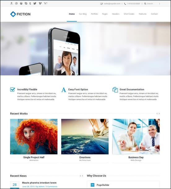
Fiction responsive theme comes with a very simple and clean design for business websites. It is based on the Foundation framework for styling varous page elements and for offering a mature and stable responsive layout. The theme includes some useful features such as 900 nice icons, boxed and wide screen layout, custom queries and loops, page builder, widget builder, layer slider and many other great features.
960.gs – Unsemantic
Here you find themes with responsive layouts based on 960.gs or its successor unsemantic.
Ability – Responsive One Page Ajax WordPress Theme – MORE INFO

With the Ability theme you will get a beatiful clean responsive WordPress theme with a one page design style. The theme use AJAX to create cool effects. Ability may suit for business website, portfolios, blogs and more. It comes with multiple options for setting up cool portfolio pages and you will find 19 portfolio backgournd images., 30+ shortcodes, showcase slider etc.
Alexx – Multipurpose WordPress Theme – MORE INFO

Alexx responsive theme based on the 960 Grid System framework. It is a multipurpose theme with many useful featured and building blocks for creating a cool websites. The theme will work well for various website types such as blogs, online portfolios or business websites.
Nexus – Responsive Business WordPress Theme MORE INFO / DEMO

Nexus is a deeply responsive, business WordPress theme. Using the built in Skin & Color Options you can completely change the look of your site in no time. Nexus also integrate with the Google Font Directory allowing you to use any of the hundreds of fonts offered by the Google Font Directory to tailor your typography for a unique, custom look. The theme comes with three fully responsive sliders. You can create sliders with any type of content you like and spice it up with a whole library of slide element animations. These sliders will be sure to create a great initial impact on your site visitors. The resource loading of the sliders has been engineered to allow for superior load times and smooth loading on all devices.
Free Responsive WordPress Themes – Starter and Frameworks
Free responsive WordPress themes used as starter themes or frameworks are stripped down templates you can use as a starting point for building your own theme or website. They are minimalistic to the extreme and require a lot more work to use compared to themes thathave been designed to be installed and used right away.
Roots Theme – MORE INFO

Roots is a WordPress starter theme based on HTML5 Boilerplate & Bootstrap from Twitter. It’s clean and single column website is great for personal or portfolio sites.
The Bootstrap – MORE INFO / DEMO

A WordPress Theme based on Bootstrap, from Twitter. It features a 100% responsive layout, a superb gallery and image handling with a custom image meta widget and carousel for gallery post-formats, the Glyphicon Icon set, a clean and simple design and a lot more! The Bootstrap runs on HTML5 and CSS3, a 12-column grid and comes with custom jQuery plugins. See the Bootstrap documentation on GitHub for reference.
[exec]echo get_avatar( get_the_author_email(), ’80’ );[/exec]
Dustin Betonio is a Translation Management graduate at University of Mindanao. His earlier career was devoted on customer service outside the information highway. Currently studying Law in the same University.


Great collection of WordPress themes! Every theme layouts and designing is good. Really
I like and enjoy your themes list.
Dustin, Thank you for bringing this issue forward. I have spend $1000 in development of a “responsive” site to find in the end that the menu does not show up on small phone screens and iPads. (It shows the infamous box with the 3 black lines only) I have done hours of research to find a responsive site that has the features I need, just to find out sites that “claim” that they are small screen compatible indeed have the same problem. I found a perfect responsive theme and found it has that same menu box on phones and iPad… Read more »
hi,
I am looking for a wordpress responsive theme that has great video tutorials with voiceover. Most have decent documentation, but I like to watch and listen to someone walk me through it. what are your thoughts?
Hi Rande
I can understand why you would want a theme with a good video tutorial. This is indeed possible to find, but it is also important to find a theme with good support and customization options. Good luck.
Kind regards
Anders
Nice collection of responsive wordpress themes. Seems like you have dona a whole lot of search to get those themes. Thanks for sharing.
You’re welcome – and thank you for your comment 🙂
Thanks for sharing this very helpful and detailled overview of free wordpress themes (responsive). Especially when I’m developing my own project based on WordPress!
Very cool collection!
Hoped you found what you were looking for
Someone answered my prayers for pinning this article!! Thank you so much for gathering all this information, so many great themes to choose from!
Thanks for sharing these amazing themes.Great stuff in here!
thanks for list, but which one will be the best for portfolio + some test informations and good tuning design ? 🙂
I’m amazed at the fact some people think everything should be free… for sure people develop for the love, but really, these are not expensive. NOT expensive. Supporting developers is really important, they are the life blood for a future of dynamic adventures.
Great. I love Momento.
Great collection! Small issue: the links to Scherzo do not work.
Dustin
Congratulations for sharing your knowledge.
It seems that all these issues are good indications, it is difficult to choose.
Again thank you for the excellent article quality.
omm! yammy wordpress themes but all are not free 🙁
Of not, so much work has been put into them.
Very nice collection of wordpress themes has ben shared
elegant wordpress themes
[…] Another advantage of WordPress is that with the use of the right theme, your website should be mobile friendly. […]
[…] a browser website and a mobile website designed and developed. If you transition your website to a responsive theme, you can support all devices […]
[…] a browser website and a mobile website designed and developed. If you transition your website to a responsive theme, you can support all devices […]
I do not even know how I ended up here, but I thought this post was great.
I do not know who you are but certainly you are going to a famous blogger if you are not
already 😉 Cheers!
Thanks for the information,
Nice collection of themes,it helps designers for choosing best theme.
I love SmartStart. I am definitely going to be using these for clients!
Awesome themes!
Hi, Nicolas! Thanks for this post, i have save come links for future posts of ny blog 🙂
Thanks for the themes! They look awesome. Thx for sharing
Thanks for the themes! They look awesome.
Thanks for the article, I am using Yoko for my website and it helped me for choosing next theme for another website 🙂
Cheers,
Christina
Yeah! Pretty neat responsive themes!
My favourite is SevenWonders! What do you think about this one http://www.designwall.com/wordpress-theme/wallpress/?
[…] did try a couple of ready-made responsive themes for WordPress, to save myself the trouble of doing it manually, but I didn’t like any of […]
[…] This allows you to focus on your business and creating a cool portfolio. Keep in mind that 60+ Best Responsive WordPress Themes are really hot right now because they allow your visitors to see a perfect website/portfolio no […]
Thanks for this.. Since the mobile world is exploding with various devices and screen sizes, planning your website design with this in mind is critical!
Thanks for some great Inspiration!
One theme that I found the other day and that seems to be impressive in many ways is
” Nimble — Multipurpose Retina Ready WordPress Theme “, anyone heard about it or is using it? This wordpress theme was featured on ThemeForest and it has a layout builder that seems easy to use and is Retina-ready. Any feedback before i purchase this one or other theme would be highly appreciated 🙂
Thanks Johan
Greetings !! this was a really nice post.this website is really good. In idea I would like to put in writing like this additionally – Responsive theme helping in seo because web execution is really good.
Thank you very much for this great collection of responsive themes. As a professional photographer, being able to present my portfolio on-the-go is a must. Too many times, I have wished I was able to show my website to potential clients on my Android or their iPhone, and while the design was great on a computer, the mobile presentation was a complete mess. I’ll no longer have that problem now.
Hi Lars, do you know a responsive WP3.4 corporate business theme (HTML5 CSS3 seo optimized) with mega dropdown menu plz ?
Thanks.
link to demo of Shepard is wrong.
Thanks John
Just fixed it.
I’ll use Reverie for my amazon review site.
thank you so much for your detailed review. you saved me so much time in searching through millions of available themes. great job.
now all i have to do is to start creating my website.
thank you.
cheers
ewa
Love the Artboard and Aware themes, the unique layout of Artboard really caught my eye. Hope we see more themes like this coming along as HTML 5 and responsive design becomes more popular.
Love the list! Great selection!
Great list! damn, still can’t decide which responsive theme to use.. >_<
Nice collection of responsive themes.
You’ve missed one theme, Commerce — a premium wordpress ecommerce theme with pinterest style, also it does responsive too for all devices. check it out http://themeforest.net/item/commerce-versatile-responsive-wordpress-theme/2569077
Thanks for sharing this theme. I will check it out soon!
Hello,
Thanks for sharing post. But can anybody tell me where I can find informations/tutorials/articles how to build a responsive theme?
I’d like to code theme by myself and I’d really like to learn.
Thanks in advise!
Best regards, Marcos.
Marcos:
A great place to start is with the Bootstrap UI framework (http://twitter.github.com/bootstrap). It will do all the heavy lifting for you, and as you code your first theme using it, you’ll start to understand the nuances and considerations necessary to build your own from scratch.
Actually coding is a great way to learn!
Thanks!
nice template.
Thanks for all your help, I like really nice themes.
I’ve used Super Skeleton and love it. I also like Siimple. Has a nice, modern look.
I love the ”Innovative” theme! Perfect for a business site. I would appreciate to have one for a products review site for affiliate marketing. Please advise me.
I only saw one responsive theme that uses the Twitter Bootstrap toolkit. WordPress themes that use all of the features of the Bootstrap toolkit are super nice! One of my favorites is StrapPress.
Thanks for these themes. You should also add Eleven 40 child theme for Genesis too.
Thanks so much! I’ve been researching responsive themes, and this is the best collection I’ve seen. Cheers!
Responsive theme is the 2nd most popular Theme on WordPress.org and it was released like 50 days ago, you can add it too.