
If you work in the web industry you have probably paid attention to the responsive hype hitting us like a tsunami.
The word “Responsive” is almost as hot as “Cloud” has been in the hosting industry over the last two years. The reason for the popularity of responsive website design right now is the need for making websites accessible to mobile users that are soon to be accountable for 10% of the internet requests.
A good example of this trend is the sudden large availability of premium responsive WordPress themes that sell like fresh-baked bread.
I believe that responsive web design techniques and ready to use responsive themes and frameworks are likely to have a strong disruptive effect on how we all build websites in the future. Very soon customers will not accept solutions that ignore mobile users and while dedicated apps and mobile sites still are valid options for large budget projects I guess responsiveness is here to stay and rule.
As always checking up on what other designers have done can be great inspiration for your own projects. Responsive website design as an approach is still quite new and it can be difficult to imagine the many new possibilities it offers. Some simpler responsive designs simply scale the graphics while others implement unique designs for every standard screen size.
Below I have collected some really stunning examples of responsive websites but first lets look at how to investigate a Responsive website and check out the cool designs. This post was updated with more examples and tips.
[exec]$filestr = file_get_contents(‘http://www.tripwiremagazine.com/googleadsensebelowmoretag.inc’);echo $filestr;[/exec]
How-to Easily Check All Layouts of a Responsive Website
When you seek inspiration for responsive design it is important to see how the layout will be rendered in various screen sizes.
Obviously the best way to see all layouts of a responsive website is to test it in all the different browsers, screen sizes, devices etc. it is required to support. However the responsive effect implemented by media queries work as well in a modern desktop browser if the window size is changed. This way you can simulate how the layout will be presented in different devices with smaller resolutions and viewports.
One pretty easy way to set the right browser windows size to simulate a specific viewport is to use ’responsive like resizeMyBrowser. It allow you to open windows in predefined dimensions.

Another pretty cool tool is ResponsivePx that kind of works the same way as resizeMyBrowser, but you have more control of the window sizes. If you have a specific need this works for you.

Really Cool Responsive Website Designs
Now time to get the examples on the table. I present them in four typical viewport sizes (width) 320px, 480px, 768px and 1024px. Tip: A really great way to see more layouts at once is using the responsive presentation tool by Matt Kersley shown below.

If good responsive website have been left out below I would love to hear from you and I will consider to add them!
The Boston Globe
Boston Globe is a great responsive example as it shows how a busy newspaper layout can be adapted to the different screen sizes in an elegant way.

Food Sense
This is a magazine style layout that adapt nicely to the various screen sizes. Pay attention to the left side navigation that jumps to the top as the width is decreased.

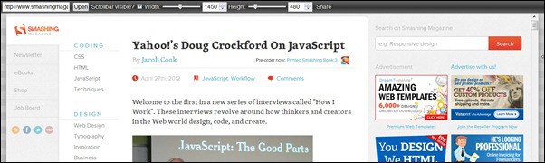
Smashing Magazine
Smashing Magazine is probably one of the coolest and most advanced responsive website designs I have seen. You all know this site I guess, but if you have not seen it in various responsive states you should go and check it out. In windows above 1500px (width) the layout takes the entire navigation and put it to the left making optimal use of the space available. Try testing the site in ResponsivePx and see for yourself!

Webdesigner Wall
Webdesigner Wall is another really great example of how well Responsive blog design can be done.

Fork
Fork is a CMS platform and their site really shows how responsive design can be implemented elegantly. The key slogan text remains in all layouts and I like they way icons are used to showcase and extentions. As the viewport is getting smaller the number of icons is reduced but there is a “More extensions” option. This idea allows the mobile site to work / convert after same design priciples as the default layout for browsers but in a mobile friendly way.

Colly

Bluegg
Bluegg is also a responsive blog design but more simple than the two previous ones. The way it is done is what we see on most responsive designs so far. The layout is the same but scaled until the screen size is very small (smart phone size with around 640 px). Then the layout is changed to one column and sidebar ect. is placed below the main content.
![bluegg[3]](http://www.tripwiremagazine.com/wp-content/uploads/2012/04/bluegg3.jpg "bluegg[3]")
Sweethatclub
Sweehatclub is not just about sweet hats… the responsive design here is really sweet and features four unique layouts.

Bootstrap
Boostrap is an example of how column design and navigation can be made responsive in a cool way. In stead of showing the menu all the time (taking up space = more scrolling) it is a drop down menu. Another typical way to do navigation is to use a select box as seen above on Smashing Magazine.
![bootstrap[3]](http://www.tripwiremagazine.com/wp-content/uploads/2012/04/bootstrap3.jpg "bootstrap[3]")
Heathlife
This site has a full with rotating background slider image and map in all sizes and it looks quite lovely.

Love & Luxe
The typography is very strong on this responsive site in all sizes and there are some pretty cool navigation moving around.
![love-luxe[3]](http://www.tripwiremagazine.com/wp-content/uploads/2012/04/love-luxe3.jpg "love-luxe[3]")
Oliver Russell
I think the idea of having text direction for the navigation change to vertical is great. However I checked and found it to be implemented using images and it does not load when resizing. It will work when the page is loaded in the intended screen size e.g. on an iPhone. Also notice that the logo text change.

Andersson-Wise Architects

Jchebly

Lancaster University

Palantir

Rachel Nabors

CSS Off

Open Medical Device Research Library

United Pixelworkers

dConstruct 2012
![dconstruct[3]](http://www.tripwiremagazine.com/wp-content/uploads/2012/04/dconstruct3.jpg "dconstruct[3]")
Performance Marketing Awards

Lars is passionate about web design, web development, SEO, social media and loves to look into new technologies, techniques, tools etc. and to write articles for tripwire magazine readers.


yet others offer inspiring collections of responsive designs
yet others offer inspiring collections of responsive designs.
Good Collection of the responsive design
Good content you are shared.Thanks a lot for sharing valuable info…
Informative content and priceless template collection
Hi Good Collections of Web Designing Themes…..Its very helpful for new web design creation
Very nice.. it is more useful for me, thanks for sharing your knowledge.
Good collection for Responsive Website Design,
Your site inspired me, over the last month I created a responsive design.
Let me know what you think!
Thanks, Brad
Your method of explaining the whole thing in this piece of writing is
truly good, every one be capable of effortlessly be aware of it, Thanks a lot.
[…] any business blog or portfolio, and it’s created by using the latest HTML5 and CSS3 techniques. With a responsive design it is easily usable with any device (Desktop, tablet, mobile phone…), without removing any […]
[…] with guidelines and tutorials, others shed light on the role of media queries, and yet others offer inspiring collections of responsive designs. Let’s not focus on these more general aspects now. Instead, let’s take […]
Yet another Perfect List. Inspired me very much.. Thanks
[…] The simplest solution is to design your page using responsive web design, a term coined in 2010 to describe setting up the page so that it automatically adjusts to a wide range of screens and sizes. One example follows, more can be found at TripWire. […]
There is a new tool for testing responsive websites on multiple devices in real-time, without reloading the browser! Jolly app is now available on the Mac App Store Jolly App on Mac App Store
[…] with guidelines and tutorials, others shed light on the role of media queries, and yet others offer inspiring collections of responsive […]
[…] Examples of great responsive design: Some examples of great – and very different – approaches to responsive layout and design. […]
[…] Even more examples of responsive design […]
[…] Image from the post Examples of Great Responsive Website Design. […]
Lars, great article!!! Wished I would have stumbled upon this sooner. Really like the resources and multiple site examples you put together. Would make a great website. 😉
Thanks for your comment Michael -always nice when our work is appreciated 🙂
Best regards
Sofie
This is a fantastic list, thank you for the inspiration 🙂
For the sports fans out there, http://www.fanland.com is a social sports site with a great responsive design.
Great collection of sites. Feel free to add legnd.com
Good list, you can add http://www.dezvolta.com
Here’s a couple our firm recently did (which I think are really nice!)
moiseswines.com
skubadesign.com
That’s awesome sample of Responsive Design we ever seen.
Very cool! It took me awhile to make my site responsive because it was my first time. I now understand how tedious this could be and have more respect to those who build their site responsive. Great article and thanks for sharing!
yes it is quite a task if done the cool way.. where every major screen size have their own unique layout…almost like creating 2-3 websites
Very true! As a web designer, you also be passionate about this kind of job and dedicated as well. If you have these two values, then you will gain a good outcome in your designs.. 🙂
So many techniques you have explained here is really nice to read. I get to understand so many techniques here.
Nice list. We ensure all our new site are built to respond to the device.
Amazing Replied Thanks Milton
Great Website List Thanks for sharing