
Using a CSS Grid System is really worth considering if you’re planning to create a complex web design like e.g a magazine layout.
For quite some time CSS Grid frameworks have been very popular and helped designers and web developers to create well structured and easy to maintain solutions. However there many options available and it is not an easy tasks to make the right pick when starting up a new project.
This article will give you the overview and tools you need to get started by presenting more than 45 CSS Grid systems and tutorials on how to use them. If you are looking for examples and inspiration on grid based web design you need to check this article.
Update: While the grid generators below still work I think you should now that it more or less have become the de-facto standard to use responsive layouts. The success of this design approach is driven by the demand for mobile ready websites. You can check some examples of responsive website here. Also you should know that the easiest way to get a responsive website set up is to use WordPress and a responsive theme. [exec]$filestr = file_get_contents(‘http://www.tripwiremagazine.com/googleadsensebelowmoretag.inc’);
echo $filestr;[/exec]
Introduction
Cascading Style Sheets (CSS) is used to describe the presentation of a document written in a markup language. Its most common application is to style web pages written in HTML and XHTML, but the language can be applied to any kind of XML document.
Cascading Style Sheets offer significant advantages compared to the other option available – table-layouts. First of all CSS provides a strict separation between layout, design of the page, and the information, presented on the page. This means that the layout of all pages in a website can be changed at one by editing style definitions in one .css-file that all the web pages link to. The separation of layout and information also means that loading different .css files with the same content pages one can completely change the aspect of the site, making it perfectly suitable for immediate user needs fx. screen, printing or mobile devices.
While CSS may offer many advantages and gives the developer very high level of control of the layout it is still quite hard to implement complex designs correctly and fast from bottom up and without having experience and good tool support. This is where this article comes in handy and provides you with the tools and tutorials needed. Another great way to get a website with an excellent grid layout is by using a WordPress magazine theme or a WordPress news theme as they are typically grid based and optimized for holding lot’s of content. Also WordPress ecommerce themes typically use grids to layout the product listings. Lets start with an overview of the Grid Systems available.
CSS Grid Layout Generators
Layout grids have been used in print publishing long before the Web ever existed. CSS Grid layouts are the invisible foundation used to achieve visual cohesion in magazine and newspaper page design and layout. CSS Grid systems offer an effective design approach for layouts and assist in communicating main messages clearly to the reader. They created ordered hierarchies, proportional relationships, and clear visual paths for the eye to travel. The same concept has been adapted for web page design for much the same reason, using CSS (Cascading StyleSheets) code to position HTML elements.
Regardless, of whether you use CSS grid layouts for prototyping or production systems, there are multiple benefits:
- CSS Grid systems provide uniformity and consistency in placement of HTML elements
- CSS Grid more or less liminates the need to use nested HTML tables.
- Gives visual design cohesion between page elements.
- Nested sub-grids, for very complex designs that are relatively simple to produce.
- Easier to apply the “rule of thirds” and the “golden section” to design, which results in a visually appealing layout to most human eyes.
- CSS Grid make it easier to apply images and text callouts to produce asymmetric layouts for visual texture.
- Reduced future effort if you need to reposition elements or change rendering characteristics (typography, margins, etc.) for related elements en masse.
- Cross-browser support, so less screaming and hair pulling when you get around to testing for that bane of designers, IE. (Bill Gates must have felt so unloved as a child to have produced so much software that does what it wants, in defiance of standards that MSFT supposedly supports.)
- Reduced effort for producing slicker web page layouts, compared to coding the necessary CSS from scratch.
Blueprint: A CSS Grid Framework
Blueprint CSS Grid includes a CSS reset that eliminates the discrepancies across different browsers. There are a lot of external tools and templates to aid your web development with Blueprint. See some live Demos

960 CSS Grid System
CSS Grid Framework is a WordPress Plugin that is worth a look. The download includes templates for Fireworks, Photoshops, Inkscape and etc. so that you can start designing your web template immediately. The PSD file that comes with guides ready save designers a lot of time.

Tripoli Framework
Tripoli CSS Grid framework had been tested and supports virtually all available browsers, including IE5! It comes with some base files, and some plugins such as “Layout”, “Visual”, “Type”, and “Negative”. Tripoli completly resets all default browser standards and rebuilds them quietly with modern web development in mind.
Tripoli is not a CSS Grid framework. It doesn’t tell you how to code your web site. Instead, it forms a solid HTML rendering engine and a base for creating dynamic layouts without interfering with typographic measurements.

YAML – Yet Another Multicolumn Layout
YAML is another bulletproof CSS Grid Framework that has a very good documentation. You can easily get started by downloading the PDF documentation and the sample project from the official site. There are some tools that will help you on your development too. For example, the YAML Builder can visually create YAML-based CSS layouts.

BlueTrip
BlueTrip is a full featured and beautiful CSS Grid framework that combines advantages from different Frameworks. The official site has a complete Documentation and Demos.

YUI Grid CSS
YUI CSS Grid support fluid-width layouts as well as fixed-width layouts. This is the advantage of YUI Grids CSS over the other CSS Grid Frameworks. To get started with YUI Grids CSS, you can download the cheat sheet and YUI Grids Builder from the official site.

Elastic CSS Grid Framework
Elastic provides a declarative language to define the layout structure and behavior. This is a young CSS Grid framework, and the best site to demo the usage of Elastic is the official site itself. The Elastic CSS Grid Framework has a lot of classes and helpers that will aid in the process of webdesign.

SenCSS
SenCSS doesn’t include a layout system, but it does provide other things such as baseline, fonts, paddings, margins and more. It comes with a commented version and a minified version which suitable for production use.

The Golden CSS Grid
The Golden CSS Grid is a web grid system. It ‘s a product of the search for the perfect modern grid system. It ‘s meant to be a CSS tool for grid based web sites.

Content With Style
This is a fixed width layout and the zip files contains a few layouts such as vertical navigation with 1 content column, vertical navigation with 2 content columns, and etc.

CSS-boilerplate
As one of the original authors of Blueprint CSS I’ve decided to re-factor my ideas into a stripped down framework which provides the bare essentials to begin any project. This framework will be lite and strive not to suggest un-semantic naming conventions. You’re the designer and your craft is important.

Logicss
The Logic CSS framework is a collection of CSS files and a toolset designed to cut development times for web-standards compliant web layouts and templates.
- Common cross-browser rendering behavior approach (not a reset).
- Beautiful font stacks.
- Typography with text resizing capabilities and vertical baseline/rhythm.
- Three totally flexible layout grid templates, customizable with the toolset.
- Elastic layout using EMs.
- Liquid layout with percentages.
- Fixed layout using pixel dimensions.

Grid and CSS Generators
Grid Designer 2.6b
This tool enables you to create a CSS Grid by specifying the number of columns and the widths of the columns, gutters and margins. You can also specify typography in the same tool and export the final CSS and (X)HTML markup. You can also bookmark your grid and typography settings and create designs with spanning columns. Created by Rasmus Schultz.

YUI CSS Grid Builder

YAML Builder

Gridnator
I haven’t investigated this CSS Grid tool in detail yet but it looks really cool.

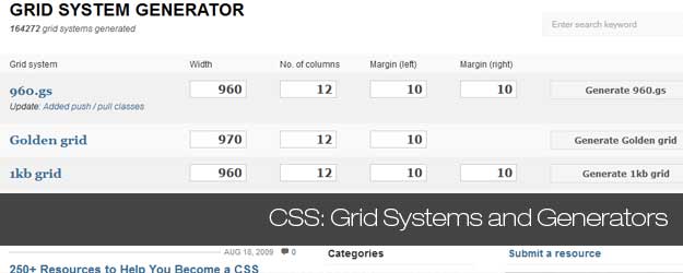
CSS Grid System Generator
The CSS Grid system generator will create fixed grid systems in valid css / xhtml for rapid prototyping, development and production environments.
In addition to the CSS Grid framework, it creates a background file (sample) that you can use in Fireworks, Illustrator, OmniGraffle, Photoshop, Visio (etc.) to aid in prototyping and design.

CSS Grid Layout Generator by Pagecolumn
Generating multi-column and CSS Grid layouts with CSS 2.0 techniques using %, px, or em.
- Nested design, more coding, generates robust liquid layouts.
- Parallel design applies to both fixed and liquid layouts, less coding.

Blueprint Grid CSS Generator
This tool will help you generate more flexible versions of Blueprint’s grid.css and compressed.css and grid.png files. Whether you prefer 8, 10,16 or 24 columns in your design, this generator now enables you that flexibility with Blueprint.

Fisheye

Variable Grid System
The variable CSS Grid system is a quick way to generate an underlying CSS grid for your site. The CSS generated file is based on the 960 Grid System.

CSS Source Ordered Variable Border 1-3 Columned Page Maker

CSSFly
CSSFly is a web 2.0 tool for easy editing websites direct and in real-time in your browser. Simply edit the (X)HTML-code and the external Style-Sheet files : what you code is what you get! This tool is designed for developers. Use it for developing, testing or checking your web-project or take a look behind the scenerys of your favourite websites.

gridfox
GridFox is a Firefox extension that overlays a grid on any website. If you can open it in Firefox, you can put a grid on top of it. It’s easy to customize, allowing you to create the exact grid you designed your layout around.

Constructyourcss.com
Construct, a visual layout editor based on Blueprint & jQuery!

Tutorials and tips
Prototype a Magazine-Style Home Page Template with the Blueprint CSS Framework
When Collis launched this site and asked readers for tutorial requests, a common one was for a “magazine themes” how-to for blog platforms. This tutorial focuses on the first part of the process: applying a CSS grid to the design to prototype a home page template.

Prototyping With The Grid 960 CSS Framework
Grid 960 is a CSS Grid Framework that enables developers to rapidly prototype designs. They are excellent tools for creating mock ups. Why? Because they do all the heavy lifting allowing you to get faster results.

Build a Newspaper Theme With WP_Query and the 960 CSS Grid Framework
WP_Query is a powerful tool to control what comes out of your loop. Today I’m going to teach you all how to use it to make a 3 columned newspaper theme that has all your main blog posts in the main column, and off to the side a set of posts with a certain category. We’ll be using the 960 CSS Grid framework for the basic layout and reset of our theme, it will chop a lot of work off what’s needed!

thegridsystem

Absolute Positioning Inside Relative Positioning
A page element with relative positioning gives you the control to absolutely position children elements inside of it.
To some, this is obvious. To others, this may be one of those CSS “Ah-ha!” Moments. I remember it being a big deal for me when I first “got it”.

CSS Grid Positioning Module Level 3
This module describes integration of grid-based layout (similar to the grids traditionally used in books and newspapers) with CSS sizing and positioning.

Grid Design Basics – Grids for web page layouts
Since tables were co-opted for layout purposes, columns have become key to many Web design layouts, and this thinking continued when CSS took over from tables (at least in the minds of savvy designers) for Web-page presentation. However, other fields of layout design don’t think in arbitrary columns, they work with grids, and these form the basis for the structure of page designs. This article will provide the lowdown on grid design for Web pages.

Grid-Based Design 101
The CSS Grid serves as the framework for page layout. It divides the page horizontally and vertically into columns and rows which work to order the elements of the design. The text and images used on the page fit into place and align with one another according to the grid. The lines of the grid themselves are not necessarily visible (although in some designs they are) but they are used by the designer to create the proper width and height of elements to align the page.

Grid-based Layout
A grid is a technique that comes from print design but easily be applied to web design as well. In its strictest form a grid is literally a grid of X by Y pixels. The elements on the page are then placed on the cell border lines and overall aligned on horizontal and vertical lines.

Designing Grid Systems For Flash
the process of creating a grid for a Flash based site that will work for screen resolutions of 1024×768 and up. The beauty of creating a grid for Flash is that you can create a fixed grid and don’t have to be concerned with the user changing type sizes and screwing up the entire grid of the site. The only time you have to be concerned with a fixed grid is if you build a Flash site where the contents of the site repositions based on the size of the browser window, in which case you would have to figure out a fluid grid which is something I haven’t done yet but plan to do in the future.

Grids: Order Out of Chaos
Invisible Structures: When and Why to Use Grids in Page Layout. Many of the pages that you see everyday have a grid. You may not see it but it is there, holding up the design, establishing structure, guiding the page elements.
Five simple steps to designing grid systems – Part 1
The first part of this Five Simple Steps series is taking some of the points discussed in the preface and putting it to practice.
Ratios are at the core of any well designed grid system. Sometimes those ratios are rational, such as 1:2 or 2:3, others are irrational such as the 1:1.414 (the proportion of A4). This first part is about how to combine those ratios to create simple, balanced grids which in turn will help you create harmonious compositions.

Five simple steps to designing grid systems – Part 2
one of this Simple Steps series I talked about how to use a simple ratio, that of the paper size you are using, to create a symmetrical grid on which to create your designs. This, the second part in the series, will deal with other ratios and how they can be combined to create more complex grid systems.
Five simple steps to designing grid systems – Part 3
The third installment to this series is going to be a little different. The previous installments have been talking through some of the basics of grid construction using ratios as the primary device.
Five simple steps to designing grid systems – Part 4
For the purposes of this article, I’m going to be focussing on the theory of creating the grid rather than the implementation. I did mention in the last series that I would cover implementation using CSS, well I’m not going to.
Five simple steps to designing grid systems – Part 5
Flexible vs Fixed. Which one to choose? Why choose one over the other? Well you won’t find the answers to those questions here. What I’m aiming to do with this article is to investigate how the theory of grid design can be applied to a flexible web page.
Design A Fresh Blog Theme On The 960 Grid

Grid-Based Design: Six Creative Column Techniques
One of the new trends among web designers has to be grid design. While grid design is a simple concept, there are now so many tools and ways of doing it that it might get confusing for newcomers. So here is my way of doing things, i.e. how I would explain grid design to someone who’s never heard about it.

Typographic Grid
This is not a “framework” or anything, I was just screwing around with typography and getting things to line up according to a strict horizontal and vertical grid. It is inspired by the Compose to a Vertical Rhythm article by Richard Rutter a few years ago, except uses unitless line height.

GridControl: A Grid Overlay System for Design Development
transparent grid paper we could lay right over the screen. We can do that. The tools are easy: repeating transparent PNG with lines, page element the size of the entire screen, some magic to turn it on and off at will. Let’s give ourselves some options and provide the user with the option of vertical lines, horizontal lines, or both.

Hacking Technique: Yahoo’s Grid System (Part 1)
“And what Yahoo! UI CSS Grid has to do with us? Well, I tried to integrate Yahoo! Grid into Blogger Beta, and the result was sweet. By injecting some additional CSS code and some div tags into the simplified version of the Beta template, one can rearrange one’s layout without any CSS knowledge. This article will show you how to do that.”
Hacking Technique: Yahoo’s Grid System (Part 2)
In this post, I get into some technical details, and it also serves as a note for myself in finding interesting things about the Yahoo! CSS Grid system. Read on if you curious on how 3, 4, or 5 columns can be achieved.
Lars started tripwire magazine back in January 2009. He is really passionate about web design, web development and loves to look into new technologies, techniques, tools etc. and to write articles for his readers.


Thankyou for this, it helped me a lot.
Could you add my tool http://www.pageblox.com to your list? Thanks!
hi
very very nice collection…………
[…] and functional website. Needless to say, it saves you a lot of time. The same is true when using CSS Grid layouts and I can assure you that this model also very popular especially in website with magazine designs […]
Great!share thanks for sharing this with us.
Great article , Nice grid systems for use in professional websites
I find that grid layouts are quite difficult to master and dont work with your existing css.
Thats why I have built a responsive gridbuilder + boilerplate + code genertr at
http://jquer.in/builder.html .Its similar to the YUI gridbuilder ,just it outputs semantic code on the basis of the IDs and classes given by the user
Really nice list. Helpful resource.
I use drupal & 960grid themes come very handy.
So thanks a lot
This is a great overview on the subject. I’m partial to the 960 grid system personally.
Wow. That is a very informative, comprehensive list. To add one more to it let me just suggest my fluid grid system – NegativeGrid. You might find it really interesting.
Thanks for this tip Chris!
Fine work in this article my friend. Thanks a lot for posting, certainly learned a whole lot here.
[…] http://www.tripwiremagazine.com/2009/06/45-css-grid-systems-layout-generators-and-tutorials-that-eve… – este é um daqueles sites que contêm 45 páginas com inumeras ferramentas sobre layout generators, criação de colunas, tutoriais, etc… […]
[…] : http://www.tripwiremagazine.com/ et http://css4design.com/ :CSS, framework, […]
960 Grid System is the most famous i guess. dont know how others facilitates but overall a great list of css grid resources
It’s the best web-advice for me! Great! Thanks!
awesome posting…
very useful one..
thanks for sharing this post….software company
Thanks for letting me know…need to check it out
Great review! I would also recommend to check out the http://psd2htmlconverter.com/en . It generates css layout right from the PSD file.
[…] so that you can position different design elements efficiently and effortlessly. There are several grid frameworks and solutions you can use to build your own grid based websites, but you will probably need the inspirational […]
[…] 45 CSS Grid Systems, Layout Generators and Tutorials that every Designer should know — tripwire ma… – 45 CSS Grid Systems, Layout Generators and Tutorials […]
[…] similar or are aligned visually is simply much easier to comprehend. This is one of the reason why grid based design have become so popular […]
[…] similar or are aligned visually is simply much easier to comprehend. This is one of the reason why grid based design have become so popular […]
cool, nice collection. I am going to try 960 now.
Nice review article on CSS frameworks and layout generators. Not only do these frameworks assist in creating changeable layouts for different display types (screen, printer, hand held), but they provide compatibility across different browsers.I use the YAML framework myself for reasons outlined in a separate StumbleUpon blog entry linking YAML. It’s much more than a CSS framework. For example, it includes the jQuery library along with its forms layouts to verify form entries. YAML supports both screen and printer layouts natively, but you can define others.
Really nice work!! amazing investigation about grid design. Its for sure one of the most important stuff that every designer should know. Mobile app development
[…] 45+ CSS Grid Systems, Layout Generators and Tutorials that every Designer should know […]
The link to CSSFly is wrong.
The Flurid project has been moved, just thought I would post the new location here:
http://projects.kflorence.com/programming/flurid/
And remember, you can always find the project on gitHub:
http://github.com/kflorence/flurid
[…] 45+ CSS Grid Systems, Layout Generators and Tutorials that every Designer should know (article) […]
Great collection and nice post. The tutorial is easy to understand and informative. Thanks for sharing the sites.
Check out Flurid, the Fluid CSS Grid System:
http://archive.kflorence.com/projects/flurid/
@Kyle, Thanks a lot for the tip. Flurid looks interesting!
[…] See the rest here: 45+ CSS Grid Systems, Layout Generators and Tutorials that every … […]
Great list now we just have to find one that suits our needs
[…] 45+ CSS Grid Systems, Layout Generators and Tutorials that every Designer should know | tr… – CSS grid layouts […]
[…] Link: 45+ CSS Grid Systems, Layout Generators and Tutorials that every Designer should know […]
[…] 45+ CSS Grid Systems, Layout Generators and Tutorials that every Designer should know | tripwire m… (tags: webdesign grid layout resources) […]
Awesome! These will help my workflow more efficiently. Thanks for this!
[…] […]
Another great post on your site guys! Found your link on Cypherbox and you really have some unique and great content – keep it up!
@Inside, thank you so much for your positive feedback! Just learned about Cypherbox a few days ago, thanks for letting me know it is generating well targeted traffic
[…] Enlace original […]
Social comments and analytics for this post…
This post was mentioned on Twitter by alecolucci: 45+ CSS grid systems, layout generators and tutorials that every designer should know http://icio.us/ausc4e…
[…] a kick ass article with allot of information and helpful tutorials about css grid systems called 45 CSS Grid system layout generators and Tutorials that every designer should know. It's a very interesting and helpful reading. I recommend […]
this are quite interesting and i will definitely use some of these. thanks for putting these out.
[…] 45+ CSS Grid Systems, Layout Generators and Tutorials that Every Designer Should Know Tripwire Magazine has compiled this excellent resource list for grid design. Some basic information is provided for each link, as well as some general grid-design info. […]
[…] 45+ CSS Grid Systems, Layout Generators and Tutorials that Every Designer Should Know Tripwire Magazine has compiled this excellent resource list for grid design. Some basic information is provided for each link, as well as some general grid-design info. […]
For wordpress exist a grid960 template implemented on basic wordpress theme for basic desing&development in http://www.designios.es/theme-base-para-wordpress-basado-en-grid-960/
[…] Sectorizando y preparando la exportación: “La buena para nada exportación HTML de Photoshop”. Configuración de cuadrícula. Ultimate Guide To Grid-Based Web Design: Techniques and Tools, 45+ CSS Grid Systems, Layout Generators and Tutorials that every Designer should know […]
Here is a good tut using 960 grid.
http://net.tutsplus.com/videos/screencasts/the-ultimate-guide-to-creating-a-design-and-converting-it-to-html-and-css/
[…] 45+ CSS Grid Systems, Layout Generators and Tutorials that Every Designer Should KnowTripwire Magazine has compiled this excellent resource list for grid design. Some basic information is provided for each link, as well as some general grid-design info. […]
[…] 45+ CSS Grid Systems, Layout Generators and Tutorials that Every Designer Should KnowTripwire Magazine has compiled this excellent resource list for grid design. Some basic information is provided for each link, as well as some general grid-design info. […]