
By using transparency in a web design designers can create really stunning visual effects.
Since modern browsers support it through transparent PNGs, Opacity and the CSS3 RGBA color definition it is getting more and more common. The A in RGBA stands for Alpha and if set to .5 on e.g. the background color it will be 50% transparent (aka. the opacity value for the color).
However acheiving full cross browser transparency is not a simple task for older versions of IE and we need to be careful what browsers the requirements include (if formally stated). The opacity in CSS3 can be set on images, text, backgound, div elements etc. and a typical use case to create a dynamic design is changing transparency on mouse over on navigation elements.
However looking into the implementations of various sites it looks like the most common way to achieve transparency in web designs is by using PNGs. For browser compatibility this may be right but we may see a change here in the future as pure CSS solutions are cleaners to maintain and faster to load.
This article focus on inspiration and ideas for how to best use transparency in web designs and below you will find some really great examples. I hope you will enjoy and use these websites for idea generation and .
Blurb Creative
Blurb Creative use transparent PNG images to create the effect where the background image is visible through the content areas. The visual effect is really cool and the PNG’s carry little weight and should not impact loading times significantly. This one would be hard to create in CSS alone.

In Photoshop one of the PNG files look like this where the transparency is pretty clear.

teamtype1
This site use transparency on the video still image in the featured area and it gives a good effect. Often videos need to be placed in top locations to make sure visitors click on them, but they can be hard to integrate into the design… this works well.

Suavia
Suavias website have a very interesting and unusual navigation working as a mega slider with navigation in all four directions. All elements on top of the dynamically changing background images have transparency applied on them. The full screen background image slider is really cool and makes the site stand out. With WordPress photography themes it is possible to get this kind of layout without starting a design from scratch. In this article, I have collected some of the best themes in this category.

Bodyshop Atl
The header / slider area of this websites frontpage is really cool and use transparency in the design to make sure the great photograpths of high end cars shine through. The area showcasing the car logos use a black background with opacity of 0.8 “background: rgba(0, 0, 0, .8)”. The rounded corners are created using the code “border-top-left-radius: 50px;”.

The top menu have been created using a transparent PNG.

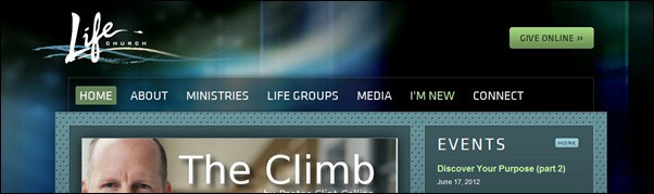
Go Life Church
This site have a background with some pretty cool colorful effects and use transparency to allow the background to be visible through the main page area containing the menu and some elements found below the feature slider. The category widgets have a lower transparency than the main page element adding to the effect and making it look as it is in fact placed on top. On the other pages more transparency effects are used and it is worth cheking out.

Raise The Roof
This site is a great example of transparency can be used as a design element. The cloudy illustration is used as background and have an un-even transition between content and navigation.


eddidit
On this portfolio web site only a few elements use transparency. It is the minimalistic icon based navigation, the footer and the slider navigation all created using transparent PNGs.

Bressane
This site have transparency more or less all over and even on the main content area. This may not work for all sites and could be bad for users ability to read the text… but it looks great.
![bressane[3]](http://www.tripwiremagazine.com/wp-content/uploads/2012/06/bressane3_thumb.jpg "bressane[3]")
fixoutlook
Pretty unique site consisting of an interactive wall of avatars constantly updating and showing tweets. On top there is a transparent PNG where the first two lines of text “Outlook’s broken Let’s fix it” is part of the image and the rest content placed within a div element.

Digiglass
This is another great looking site using transparency in PNG in the footer on top of a full with image slider. This time with a smooth gradient effect that really does a great job!

Go4 Events
Go4 Events also use a PNG to add transparency to the page (header area). The PNG is just one px width and have a light border. The CSS use repeat-x to make it fill the container #page horizontally (990 px). The result is pretty cool and loading this graphics is fast leaving more bandwidth to the heavy background image. To add further to this the designer added a graphic on top of the transparent image to the left using “position: absolute;”.

Gavin Castleton
Really a visually awesome website with horizontally scrolling pages. There are transparent PNGs in play on most pages allowing the cool full screen background images to shine through!

moradito
Careful not to get dizzy! The colors here are stronger than unusual but the transparent effect of white areas is interesting for inspiration.

Brad Colbow
Brads site use a transparent PNG to add a transparent frame around featured content. Because the background is a key part of the design and an illustration in itself this works out pretty well!

The Greenhouse
The navigation on The Greenhouse is transparent and just as the example with Blurb Creative it is created with transparency in a PNG image.

Lars is passionate about web design, web development, SEO, social media and loves to look into new technologies, techniques, tools etc. and to write articles for tripwire magazine readers.


I would like to say that this blog really convinced me, you give me best information! Thanks, very good post.
Pretty decent selections! My top two are: GO4 Events and The Greenhouse. Thank you for the great post!
Thanks Earl, yes those you mention are great, but my top is Marco Rotoli 😉