
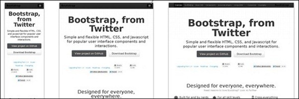

These days, everyone is using a different device, browser and screen size when browsing the web. Whether it’s large format displays and multiple monitors, or tablets and smart phones, keeping track of all the possible sizes your website could be viewed at is almost impossible.
Responsive website design can be the answer in many cases. A responsive website means quite literally that it responds properly to all devices and screen sizes. It is done by scaling down or re-organizing content on the page using some CSS and HTML trickery, in order to create the best possible user experience on your site.
Responsive design and development are still a bit new, even among the web guru community. Howeever customers start asking for it and good news is that there are some great tutorials, guides and responsive tools out there, that I’ve gathered up here for you. Keep in mind that if you want to kick start a responsive web project you can always look for some great responsive WordPress themes or responsive layout plugins for jQuery. So, here are tons of great responsive web design and development tutorials to get you started (this post has just been updated with more tutorials)!
[exec]$filestr = file_get_contents(‘http://www.tripwiremagazine.com/googleadsensebelowmoretag.inc’);echo $filestr;[/exec]
Responsive Web Design: What It Is and How To Use It
Okay, so what is responsive design and how do I use it? Well, this guide will show you how.

Introduction to Responsive Web Design: Video
This is a tutorial that is close to 9 minutes long which skims the surface of what responsive web design is about, how it came to be, the impact it has on the design of a website and what elements are involved in producing a responsive web design. If you are looking to understand what responsive web design is about without heading into coding first, you should start with this video.

Techniques For Gracefully Degrading Media Queries
What if something isn’t supported? This tutorial will show you how to degrade it gracefully.

Techniques in responsive web design
This tutorial will outline some of the techniques you’ll be using in responsive design.

Responsive Web Design Techniques, Tools and Design Strategies
Responsive design requires a strategy, and this will show you how to approach it.

Responsive Web Design with HTML5 and the Less Framework 3
This tutorial will show you how to make responsive web designs with HTML5 and the Less Framework.
Responsive website Navigation
Here’s a tutorial to help you make your very own responsive website navigation. One of the most important aspect of a website is how easy it is to navigate through different parts of the site. Find out how to optimize this with CSS3 with this tutorial.

Adaptive layouts with media queries
In this tutorial you will learn how to use adaptive layouts with media queries which affects browser dimensions (width, height and aspect-ratio), device dimensions (device-width, device-height and device-aspect-ratio), browser orientation, colour information (color, color-index and monochrome) and much more.

How To Use CSS3 Media Queries To Create a Mobile Version of Your Website
CSS3 media queries are a great way to create a mobile version of your website.

Convert a Menu to a Dropdown for Small Screens
Menus need to be responsive too, and this tutorial will show you how to handle it.

Designing for a Responsive Web
Responsiveness is largely based around grids, and this tutorial will show you how to use grids properly.

Create a Responsive Web Design Template
A full tutorial on creating a responsive web design template.

Fluid Images
Images have to resize properly for responsive designs, so you’ll learn how to do that here.

Hiding and revealing portions of images
Images may need to be hidden or expanded, and this tutorial will show you how to do it.

Responsive Data Tables
Like menus, tables are a vital element that have to be responsive, so you’ll learn techniques for that here.

Responsive Design in 3 Steps
Web Designer Wall will show you 3 steps on how to approach responsive design.

Elastic text with Fittext.js
Text is the most crucial part of responsive design and development, and this jQuery plugin with its tutorials will take care of it for you.

How To Design a Mobile Responsive Site via UX Booth
This tutorial from UX booth will show you how to make a mobile responsive site.

Tutorial on building fast and responsive websites
This tutorial will show you how to avoid slowing your website when you make it responsive.

Responsive Web Design
In case you need another guide, this one takes a different approach to responsive design.

CSS Transitions & Media Queries
Instead of having jerky transitions, you can smooth them out by following the tips in this guide.

Borders on responsive images
A nice quick tip on how to create borders for your responsive images without breaking everything.

Guide to CSS support in email
Emails can be responsive too, and this guide will show you what CSS properties are supported in your HTML mails.

Responsive Web Design: What It Is and How To Use It
Responsive web design is the approach that suggests that design and development should respond to the user’s behavior and environment based on screen size, platform and orientation. The practice consists of a mix of flexible grids and layouts, images and an intelligent use of CSS media queries. In this tutorial you will find how to use custom layout structure, fluid images and media queries.

How to Build a Responsive Thumbnail Gallery
Galleries are a great way to start understanding responsiveness, and this tutorial will teach you everything about it.

Create an adaptable website layout with CSS3 media queries
Here, you’ll find some more techniques for dealing with CSS3 media queries.

Build a Responsive, Mobile-Friendly Web Page With Skeleton
Skeleton is an awesome framework, and it is easy to build a responsive website using it.

Responsive Web Design
In this tutorial, Nikola will show you how to make your web page responsive in his full guide.

Scalable Navigation Patterns in Responsive Web Design
Navigation is the backbone of your website, so it has to work properly in responsive design.

How to Turn Any Site Into a Responsive Site
That’s right, any site can be responsive by following Steven Snell’s guide here.

Fluid Grids
Fluid grids basically work to create responsive designs by adjusting properly. You’ll see how, in this tutorial.

Designing for a Responsive Web
Want to understand responsive web design? You’ll see how to approach it from a design standpoint.

Responsive Web Design: A Visual Guide
For the visual learner, this tutorial will teach you how to understand responsiveness.
Elastic videos
Like images, videos can be a bit stubborn for responsiveness, unless you follow this guide.

Alex Naz is a professional writer with a proven track record. He is a creative blogger who is passionate about web design, SEO and web development. He is also a family man and has a passion for the outdoors.


Good posts on this blog really to read me again and again. Best luck for the future.
thank you – hope you will keep finding inspiration on our site 🙂
Best regards,
Sofie
Very good information, thank you very much
always look great guys.Thank Eric!
What Nice collection
i am goging to share this post on facebook.
Thank you for sharing our post – we appreciate it 🙂
Best regards,
Sofie
A remarkable collection about the topic of web design, which is discussed by extraordinary speakers. Thanks a lot for sharing.
Nice collections of responsive web design tutorials, I find skeleton framework is good, and easy to start with.
Thank Eric for these collections!
Thank you for all these resources. I really want to learn Responsive Web Design.