
In this article you will find a collection of Logos that can be inspiring to investigate because they either belong to very successful companies and have been created by talented designers or because they just feature good ideas and communicate messages you may not see directly.
[exec]$filestr = file_get_contents(‘http://www.tripwiremagazine.com/googleadsensebelowmoretag.inc’);
echo $filestr;[/exec]
Amazon
Amazon.com is one of the brands that nearly every Internet user know. The logo is rarely simple but there are elements in it that makes it a winner (logo below is a trademark of www.amazon.com):
![]()
The Amazon rain-forest is a unique location on our planet that we all learn about in school and therefore we associate amazon.com with something we already know. The Amazonian rain-forests have unparalleled biodiversity and it is a fact that one in ten known species in the world live in the Amazon Rain-forest. As Amazon.com have a clear strategy of being a one stop get all shop there is a match here on a conceptual level. The logo itself express this key point further by having a arrow from a–>z indicating that this company have every title from a to z. Finally some would say that the arrow can be a picture of a happy smile and I’m quite sure this is a key part of the design giving the impression that customers and /or the employees at amazon.com smile a lot.
apple
Apple is one of the very few companies that doesn’t use its name in its logo. Yet, the Apple logo is one of the most recognized corporate symbols in the world. The first Apple logo was designed by Jobs and Wayne in 1976, featuring Isaac Newton sitting under an apple tree.
That Apple logo was immediately changed by designer Rob Janoff into a multicolored apple with a bite taken out off its right side, better known as the “rainbow apple”. Using an apple as a symbol for a company that really have nothing to do with technology is what makes apples brand different but powerful. Everyone know what an apple is and there’s already a memory link in peoples brains ready to hook up with the apple brand. Seen once it will always be recognized. Apples are the fruit you hear about in the bible, in health advice (an apple a day..) etc. it’s the right fruit Jobs picked for his Logo…The bite in the right side of the apple indicates that somone just couln’t withstand the temptation and you’re next! (logo below is a trademark of apple)
![]()
For the last few years, the Apple logo has appeared in various colors (aqua color scheme was famous among all). But now Apple has discontinued the use of bright colors in the Apple logo, instead opting for white and raw-aluminum color schemes. The polished chrome logo seems to fit ideally.
FedEx
FedEx, a very large logistics services company, has has another og the really simple and well known logos. FedEx is an abbreviation of Federal Express, the company name that was re-branded in 2000 to FedEx. There are also in this Logo elements that makes it unique. (logo below is a trademark of FedEx)
![]()
First of all the FedEx wordmark is notable for containing a hidden right-pointing arrow in the negative space between the “E” and the “x” as indicated with the thin red arrow on the image. This is clearly an intentional placement of a symbol that fits very well with the key business of FedEx – tranportation of goods from A to B in the shortest possible time.
Another thinkg about this Logo is the use of colors. FedEx is organized into operating units, each of which has its own version of the wordmark, designed by Lindon Leader of Landor Associates, in 1994. The use of different colors for each operating unit is a way to create unique variations that are all closely linked to the general concept. The Fed is always purple and the Ex is in a different color for each division.
- FedEx Corporation(Grey “Ex”)
- FedEx Express (Orange “Ex”)
- FedEx Ground (Green “Ex”)
- FedEx Freight (Red “Ex”)
- FedEx Trade Networks (Yellow “Ex”)
- FedEx Custom Critical (Blue “Ex”)
![]()
Google is one of the best company brands in the world and at the same time it is quite new. Google began in January 1996, as a research project by Larry Page, who was soon joined by Sergey Brin. The name google is known to be a misspelling of the term googol. Googol is the larget named number 10100 (the digit 1 followed by one hundred zeros). A googolplex is the number one followed by one googol zeroes, or ten raised to the power of one googol: 10googol = 10(10100).
The name google is also very related to the word goggle where the first “g” has been replaced with an “o”. The two “o”s could be seen as an image of a pair of “Google glasses” (yeah I know goggles is really glasses that workers use to protect their eyes…) giving users the power to find what he or she is looking for on the ever growing Internet having googols of pages online ;))
It could be fun to see how googles first logos looked don’t you think…We are lucky that google keeps their history intact and you can find it here!
Googles current logo is from 1999 but Google routinely modifies its logo in accordance with various holidays or special events throughout the year but it is normally just variations of the main logo. These temorary logos goes under the name Doodles. Below is a great example of the one of googles Doodles that have hidden messages. Google is celebrating 25 years of TCP/IP and the New Year 2008. (logo below is a trademark of www.google.com)
![]()
1) In this message Google is showing a cable making 2008.
2) The second message shows “SYN SYN/ACK ACK” on the bottom of the logo in little colored dots. The syn syn ack ack is referred as a “Three Way Handshake.“
Sun
Sun as a name use the same strategy as amazon and apple. There are no-one on this planet that doesn’t know the word sun and therefore it is clearly very easy to remember their company name. The “Sun” is besides that the life giving object in space that we all associate with primarily good things. (logo below is a trademark of Sun Microsystems)
![]()
The SUN Microsystems logo is a wonderful example of symmetry and order. It was designed by Stanford University’s professor Vaughan Pratt, who skillfully arranged the letters “U and N” adjacent to each other forming the alphabet“S”, when seen in perpendicular direction. The Sun “cube” further use this idea by having sun written from left to right on all four edges.
Rails in logos
Clearly the parallel lines in the VIA (Rail Canada) logo is designed to act as a picture of rails. The typography used also makes “V” and “A” look like arrows indicating direction ans transportation. This is a very simple and powerful logo.
![]()
The British Railways Logo contains some of the same elements.
![]()
Oven
Putting the heater from the oven in as a “E” is a fun idea…
![]()
Unreal Design Studio , London
Home Delivery
![]()
Unreal Design Studio , London
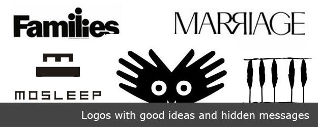
Families
Families magazine from Readers Digest has an interesting logo. Putting a dot above the “l” and lovering the last “i” makes it look like three persons belonging to a family. This is a very clever use of typograpthy in a Logo to deliver a message.
![]()
Marriage Logo
Marriage another magazine from Readers Digest. This logo is so simple but the idea of having two mirrored “R“s is brilliant as it indicates to persons being close together face to face. I have seen other Logos use mirrored “R”s like this also.
![]()
Royal Park
This logo combines leaves from trees in a way that makes up a crown…. This is a a great combination of visual elements that represent the company name.
![]()
Plant
The “a” in this logo features a leave in the middle…good use of a element in a plant in the logo itself…
![]()
Yoga Australia
Looks like this logo is a simple picture of a young girl doing her yoga but if you watch it carefully the body posture is creating the Australia Map in the negative space between her leg and arm.
![]()
Cubic Metre Furniture
The company took advantage of the fact that metric system had just been introduced in Britain, but also the names of the three partners that founded the company all began with M.
![]()
credits: Minale Tattersfield
ClubCollective
ClubCollective a night life portal and the logo was designed by the talented people at Bunch, a design agency based in London, Zagreb and Singapore.
![]()
Goodwill
Most people don’t realize that the smiley face at the top of the logo is also a lowercase ‘g.’ Known as the “Smiling G”, it is used to represent both the company name and the smiles that come from helping people help themselves.
![]()
Hartford Whalers
The old Hartford Whalers logo clearly shows a whale’s tail and a green W. Look closer, though, and you’ll see that the white space forms an H, for Hartford.
![]()
Eight Logo
This logo is cleverly designed with a typeface where every letter is a variation of number 8. This is a great idea for a Logo if your company name is Eight and clearly there has been a lot of creative effort put into this great Logo.
![]()
Mosleep Logo
The designer of this interesting Logo have integrated a bed and the letter “M” in a way that makes the M look like the pillows. This is a very clever and creative use of the elements available.
![]()
Toblerone Logo
Toblerone originated in Bern, Switzerland – A city whose name is rumored to mean, “City of bears”. The logo clearly shows the Swiss Alps then…? But when you look at it again you will find a bear in the logo. Incredibly surprising that one could look at this 100 times but never notice it!
![]()
Big Ten Logo
This logo have the number “11? worked in around the letter “T” acknowledging that the conference actually has 11 teams. Big Ten has been really creative with its logo as it ties together the name with some extra information about the product.
![]()
Piano Forest Logo
If you notice this logo closely you will see the trees placement form the keys of a piano. This is an clever way to display two different terms, “piano and forest”, through a single logo concept.
![]()
NorthWest Old Logo
This logo is splitting the letters, N and W (north west) along with a location pointed to by the red triangle in the upper left corner. This technique is used in other Logos as well and it can be a great way to fit multiple letters into a very narrow space.
![]()
Amnesty International 30th Anniversary
This logo was designed by Pekka Piippo from Finland, for the Amnesty International 30th Anniversary of Finnish Division. Clever multiplication of 5 fingers on 6 hands mark the occasion of 30th Anniversary occasion.
![]()
Logo !N3K8
Using the pronouncement of numbers to form a word on less space is quite popular these days. 4 is often used as replacement for “for”. Like in”free 4 you”. 2 is also used as replacement for “to”. Like in “face 2 face”. This Logo have two numbers and use 3 and 8 to form the word “intricate”
![]()
ED Logo: Gianni Bortolotti
The designer of ED – “Elettro Domestici”, “Home Appliances” in English, changed the concept of traditional logo designing through this logo. The designer has amazingly used the negative space to demonstrate the letter “E” and “D”
![]()
Cluenatic
This logo is designed for a puzzle game that involves unraveling four clues. The letters C, L, U, E are arranged like a maze, to deliver an intriguing feel to it.
![]()
Body Wisdom
In this case, a logo design for a high end day spa,the hands effectively convey massage, while the proximity of the “eyes” within the owl shape created by the hands clearly say “wisdom”.
![]()
Fun IBM Logo
This was a logo designed in-house for some internal event at IBM. It seams like they are quite relaxed about the logo, unlike certain other companies who do not like the logo to be tampered with in any way even for internal promotions. This is mostly relevant for inspiration I think…
![]()
Lars started tripwire magazine back in January 2009. He is really passionate about web design, web development and loves to look into new technologies, techniques, tools etc. and to write articles for his readers.


BEST EVER!!
I find the use of this technique in logo design to be rather important; it says more about what the entity does/serves than just a name in a typeface.
Some of my own examples of this:
http://logopond.com/gallery/detail/30933
http://logopond.com/gallery/detail/58323
http://logopond.com/gallery/detail/166438
http://logopond.com/gallery/detail/110493
amazing logos
Amazing logos they are very nice, thank you for sharing
all the logos are wonderful, the designers are more than creative geeks.
One of my faves:
http://logofaves.com/2010/01/spartan-golf-club/
dive into information techology
Just to be a math nerd:
“Googol is the larget named number 10^100 (the digit 1 followed by one hundred zeros). A googolplex is the number one followed by one googol zeroes, or ten raised to the power of one googol: 10^googol = 10^(10^100).”
Obviously googol is not the largest named number. You even mentioned an example of a larger named number in the next sentence, googolplex.
http://en.wikipedia.org/wiki/Names_of_large_numbers
[…] 12. Tripwire magazine […]
I suspect that most people, including myself, lack the knowledge or training to be able to analyse \’good\’ design – or to different it from \’clever\’ design. However, I have enough nous to appreciate clever design and the fact that the clever designers treat me with enough respect to assume that I can figure out and appreciate the puzzle/conundrum/humour if I ‘got it’ straight away, and delight in the pleasant shock if I didn’t get it at first sight. If I have been stimulated, amused, entertained and delighted by the wit and wisdom of the creator, I think it is… Read more »
I found this article when googling “great logos”. I enjoyed the content, the constructive criticism submited by Roy S , and the respectful responses by both Roy and tripwiremag. An actual webpost conversation without immature personal attacks – who’d have thought is was possible! Anyway, my design experience is absolute zero; I use MS Paint when I need to create a logo or header for one of my e-commerce websites, so to say that I am an amateur would be genereous. I simply like a clever and eye-pleasing logo, one that “says what it is”. I am interested in opinions… Read more »
Hi Mike Thanks for the positive feedback and the logos that fit very well into the idea of this article. I need to ask you what services/products your e-commerce website offers and what your target group is. I think both the logos you provided links to have clever elements and you may be able to get inspired from them and the ideas they are based on. The film strip whale fin is related to the history of the local area I think (http://en.wikipedia.org/wiki/Nantucket,_Massachusetts) and it is really one of those hidden messages that the article is all about. I don’t… Read more »
It’s great to see someone ready to change their position. It’s very much appreciated. And I think I owe you an explanation for my comment. As a designer I am kind of fed up with this so-called ‘clever logos’. Every logo designer appears to be trying to hit upon some clever idea when they start designing a logo. Sometimes it works, but most of the time it doesn’t. Most of these logos look labored and not good designs at all. My problem with this is, one should not confuse great design with clever design. And to use cleverness to justify… Read more »
Thanks for coming back! Good point you put forward Roy. I guess that you agree with me that Logo trends in some industries currently seams to be dominated by either the web 2.0 wave (seriously colorful, round shapes and large types..) and a tendency that companies are trying to work their key messages into their Logos. Now first of all I think that Logos needs to be timeless but at the same time relevant here and now…not easy but I agree that having a too colorful and complex logo may not be the right approach on the long run…
I don’t think the person writing this is a serious design-scholar. He doesn’t understand the difference between a good design and just a clever design! Calling Yoga Australia inspiring because of that clever little touch is too much, take back a few steps and see how clumsy a design it is otherwise. The design must be beautiful first, and then we shall give it points for cleverness. Same goes for most other designs shown here! What a bad article! Ruined my day.
Roy, not good that it ruined your day. I understand your feedback and have adjusted the article to make sure expectations build up in title and intro fits the content.
[…] Deep Dive into the Secrets of Great Logos […]
[…] DIRECT LINK » Go to Source […]
[…] Visit Source. […]
[…] AdvertisementEver been wondering why some Logos just stand out from the rest and become “icons” that most people instantly recognize and associate emotions with? Great Logos have been designed by real professionals intentionally bringing elements into the designs that people may not see directly but that anyway somehow influence their subconscious. In this article I have closely investigated what makes some well known Logos uniqe and worth being inspired from.IntroductionThis article is not a co Go here to see the original: Deep Dive into the Secrets of Great Logos […]