
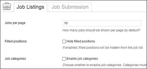
WP Job Manager – How to Turn WordPress into a Job Posting Site
WordPress has come a long way since it started back in 2001. It was first built to be the optimal platform for bloggers, however, it quickly evolved into an open and extendable system. Today, WordPress hold massive market share in areas such as business websites,...
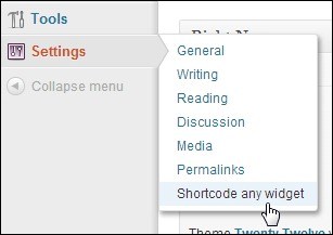
AMR Shortcode Any Widget – A Shortcode Widget Plugin for WordPress
WordPress is a great and easy to learn publishing platform and it is a pleasure to create content using the visual editor. In addition, WordPress offer a high level of flexibility through plugins, widgets and shortcodes. Widgets and the sidebar system were designed to...
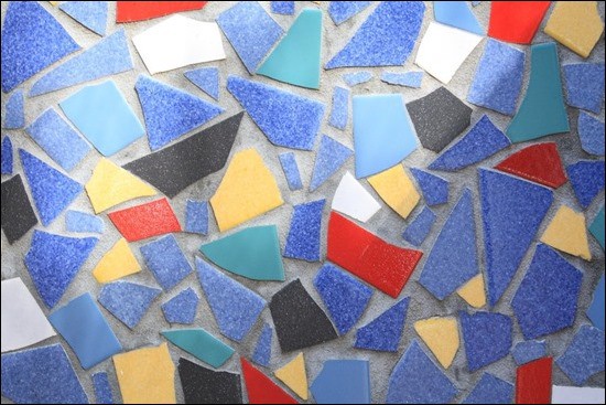
30+ Free Abstract Mosaic Textures
Mosaic art dates back to the 3rd millennium BC where artists decorated temples with materials such as shells and colored stone. It is a form of art where many small elements turn into a unified completely when viewed at distance. I find it funny that, even though the...
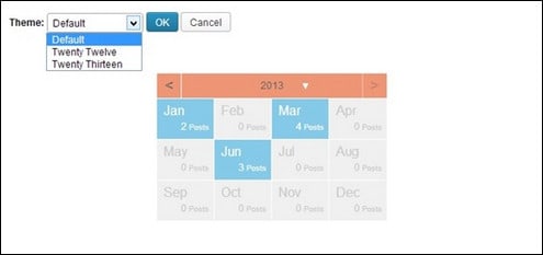
How to Make Your Archives Widget in a Calendar Form
An archives function provides a great way of organizing all your posts in a single, dated entry. It can help your site visitors find the post you have in an organized and quick way. Through an archive, it is easy for them to navigate to posts from a specific month or...
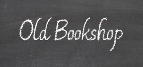
35+ Free Chalkboard Fonts – Want A Nice Back To School Design?
Chalkboard Fonts are great for creating typography with an authentic hand-written style. This kind of fonts are useful for making back to school designs and anything with elements of leaning, teaching and training. They are also great for creating menu cards, event...
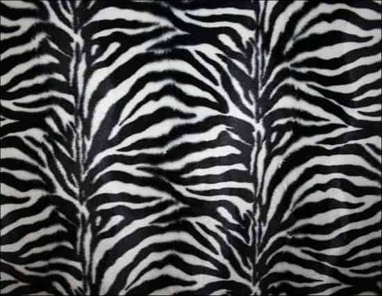
30+ Zebra Print Texture for Free Download
Physical textures can be rough, smooth and soft like for example fur. In design, we can use different types of textures to make surfaces look realistic and to give the right impression and touch on the viewer’s feelings. As an example, we often see wood textures used...
40+ Fun and Cool Stitch Fonts – Ready to Write on Fabric?
Almost any commercial design include some text to deliver “the message”. Adding the right type of typography, making sure it fits the overall idea and style, often makes a huge difference. Typography art and effects are so common in advertising that most people just...
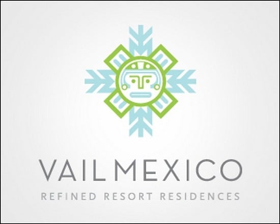
35+ Snowflake Logos Ideas
Symbols are often used in logos and work as an effective technique to spark a specific meaning or association when people watch them. There are many great examples of clever use of symbols in great and popular logos. It can be great inspiration to check inspiration...
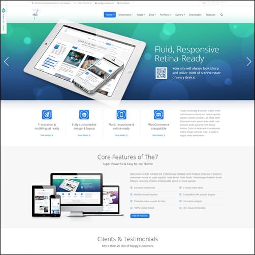
15+ Best WordPress Business Themes 2016
WordPress business themes are powerful website templates that help thousands of business owners to keep in touch with clients and customers online. A WordPress business website is an excellent showroom to present the company and its products in a professional and...