
On-line fund-raising has become a growing source of income for many non-profits over the past 10 years.
But while organizations typically spend lots of time developing clever, creative, and inspirational on-line content, they often overlook more mundane aspects of on-line appeals that can make a big difference in converting advocates, subscribers, and other supporters into donors.
Some tend to get inspiration from this way of seeing the web. Hints of techniques or approaches to attempt for next projects emerge from all corners of the web.
Now there are many considerations that need to be made when designing, especially a beautifully designed donation page whose calls to actions are often vital to the mission for the client behind it.
Which is why in this post,we have gathered together a showcase of beautifully designed donation pages for our readers,with some resources and tutorials at the end of the post to help prepare them for those potential clients to come calling. Take a peek down through to see some examples of both unique and more extravagant designs that have tackled this task with style. Happy Viewing!
[exec]$filestr = file_get_contents(‘http://www.tripwiremagazine.com/googleadsensebelowmoretag.inc’);echo $filestr;[/exec]
Donation Page Design Showcase
1. Red
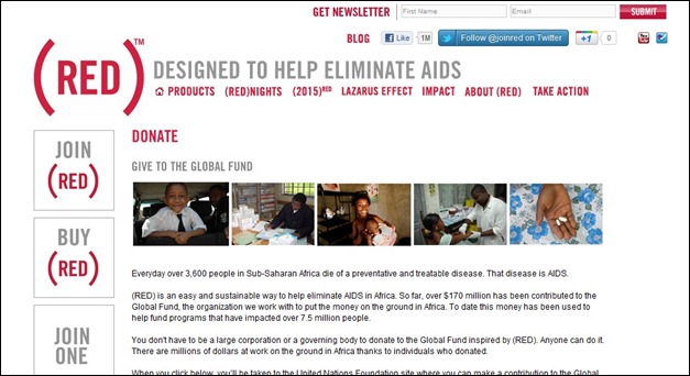
The Product (Red) site features products that support the organization prominently in a slideshow on their home page. They also include links on other ways to get involved, their blog, and learning resources in the sidebar
2. Action for Children
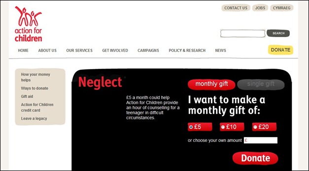
The page design has a large, eye catching call to action area which sets off the donation area nicely and effectively pulls the reader to it.
3. The Nature Conservancy
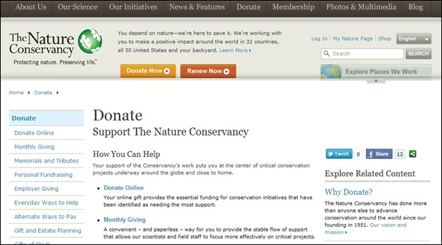
The slideshow on the home page of The Nature Conservancy’s site is one of the best I’ve seen, offering up information about various programs and initiatives they support.
4. Charity: Water
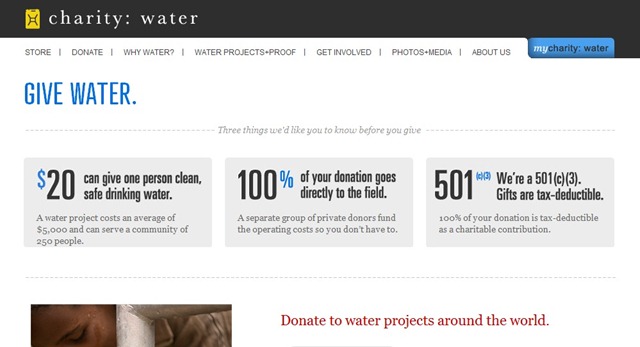
The charity: water site is a great example of how simple but bold design can make a huge impact. The donate button is red, while the rest of the site employs black and dark gray navigation.
5. Operation Warm
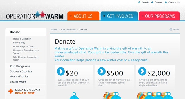
This is a nice site with comfortable, welcoming color scheme. The donation page calls vary in color.
6. Red Nose Day
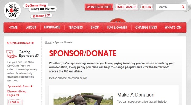
This site uses a simple two tone color scheme. The red colors pervading the donation page denoting the passion for the mission, and driving people to take action.
7. Network for Good
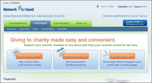
Has a wonderful design, with three courses of action that their readers may follow. Each with a large, eye catching call to action button.
8. Manna FoodBank
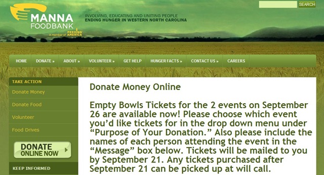
Manna Foodbank uses a natural, earth-tone color scheme which goes well with their mission. The call to action button stands apart nicely even with only the slight changes in color, next to the information about their cause.
9. Oxfam
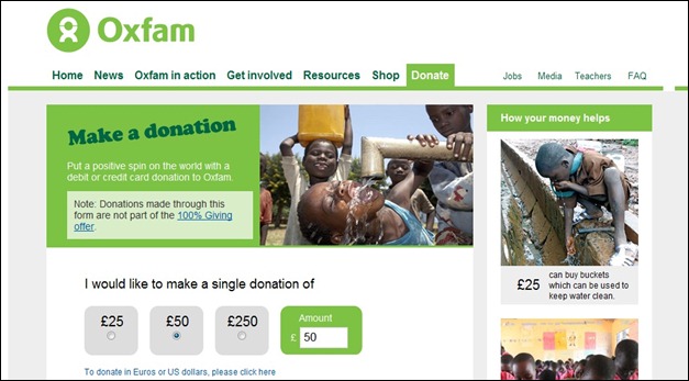
The Oxfam America website uses color to make their donation button stand out on the home page. While the majority of the site is designed in shades of green and tan but the donation link is orange.
10. Make-A-Wish
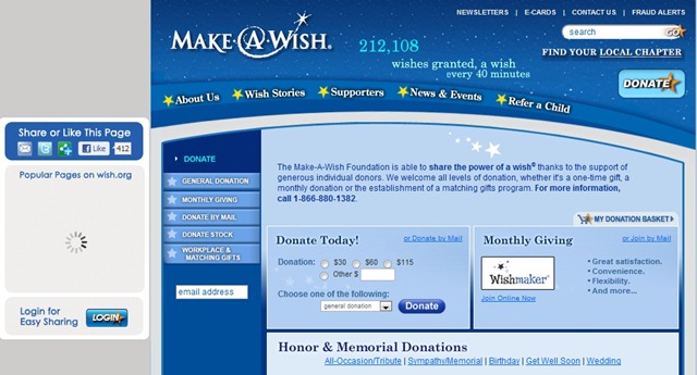
The blue becomes overwhelming with the amount of information it contains.
11. Kiva
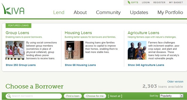
The Kiva website has a very simple and straightforward design. Right at the top of the page they explain exactly what Kiva does, and they make it very easy for visitors to lend money
12. Save the Children
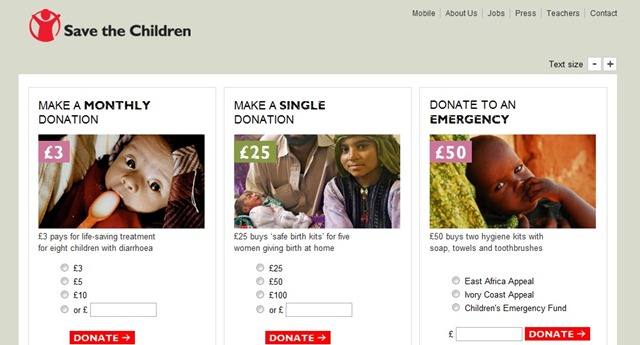
This has a sleek design for its donation page with designated avenues for assistance that the users have at their disposal.
13. Mozilla
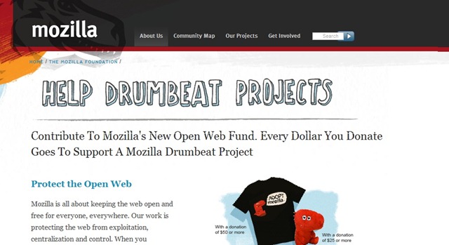
has a subtle donation page design with a creative header attached to their site where fans and users can donate to keep their mission alive.
14. Doctors without Borders
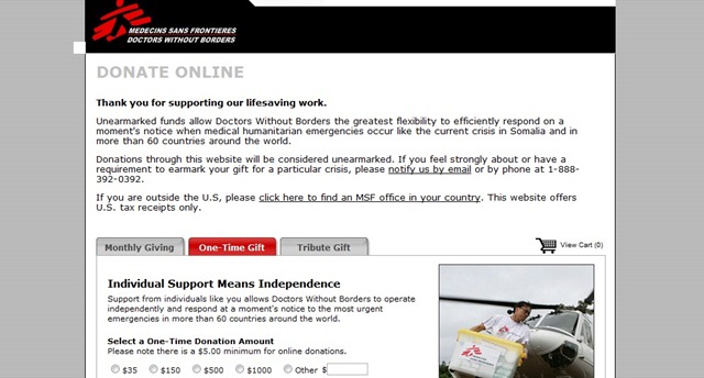
has a great donation page design, using tabbed windows to separate the various paths that users can take to pitch in.
15. American Heart Association
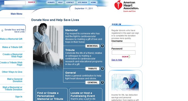
The donation page is stylish and focuses the users attention directly towards the calls.
16. ASPCA
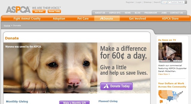
ASPCA has another subtle donation page design with the purple calls standing out from the overall orange design colors. Soft coloring imparts a sense of comfort and eases the readers into the cause and taking action.
17. Keep a Child Alive
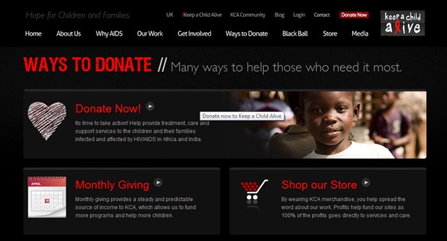
Has a very sleek design with large buttons with various ways to contribute to the mission. With a slight grungy effect used to highlight areas of the page, the design stands out.
18. Virgin Money Giving
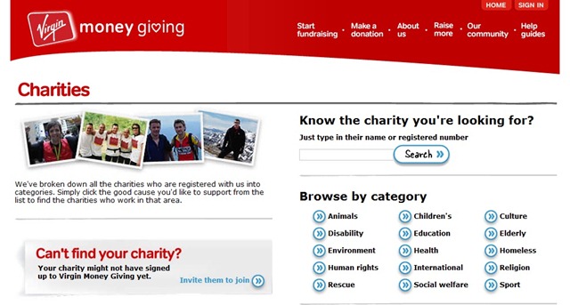
Is a unique donation page, with a category breakdown so users can find the type of charitable organization they are looking to support.
19. Humane Society
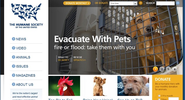
Uses large images and bold buttons to draw the users attention and persuade them to take action.
20. Planned Parenthood
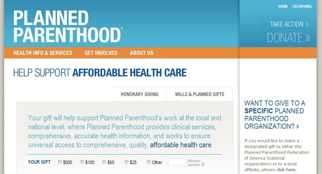
The donation page uses a form for the main appeal to the readers, with secondary (more subtle) calls in the upper right corner. Overall, the large header and large body text compliment each other leading the reader into the ‘action center’.
21. Invisible Children
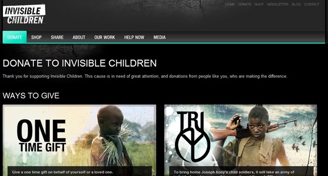
Has a donation page that is as stirring and emotive as their mission. With large images of the children the world tends to overlook connects the design with the cause in a simple yet effective way.
22. Natural Resources Defense Council
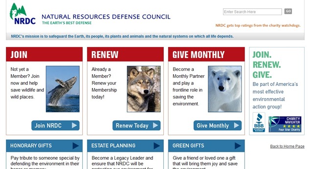
The NRDC website also makes use of color to distinguish between different sections of their site. The “Donate” and “Take Action” links are denoted in orange.
23. Giving to Johns Hopkins
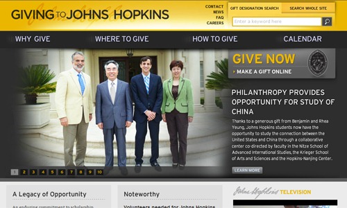
Awesome yellow header.
24. MJFF
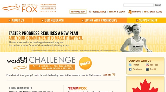
The Michael J. Fox Foundation website offers a great home page that includes tons of great information without looking cluttered. Links for living with Parkinson’s, about the foundation, research programs, and how to help are included prominently in the middle of the page. A donation link is also included in the top navigation. And news both about Parkinson’s and the Foundation are also featured prominently on the home page.
25. Donate Life California

Has a somewhat whimsical design, with pink calls to action buttons that really stand out from the rest of the site, yet match with the logo of the organization.
26. Habitat For Humanity
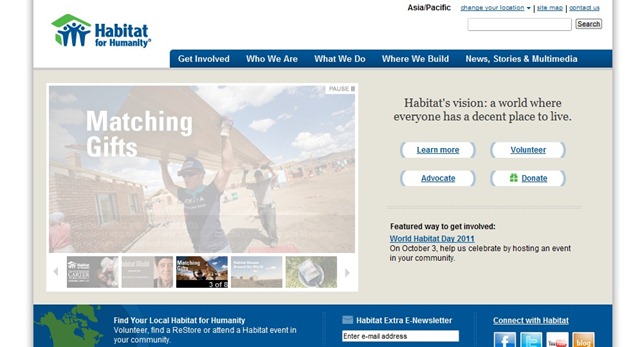
Simplistic donation page.
27. Witness
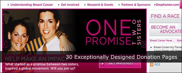
28. Susan G. Komen for the Cure
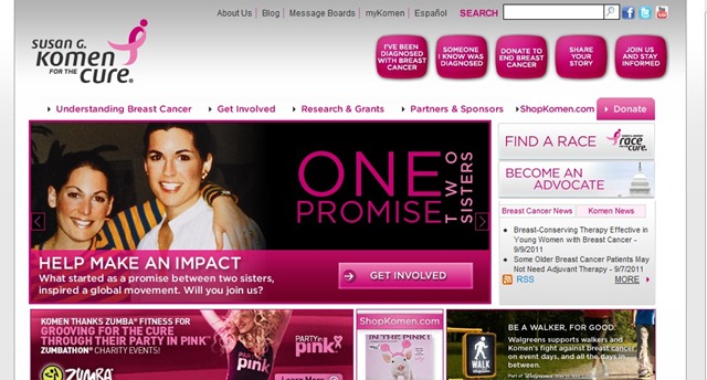
This site makes great use of space in their header for highlighting important links, including ones to pages for women recently diagnosed with breast cancer, how to make a difference, and a page to share your own breast cancer story. The donation link is featured in the header, making use of a bright pink button where the rest of the header is gray.
29. Take The Walk

The Take The Walk site makes great use of bold graphics and a slideshow on the home page to immediately capture visitor attention. A graphic showcasing how many miles have already been walked and how many left until they reach their goal is the main highlight of the home page.
30. Amnesty International
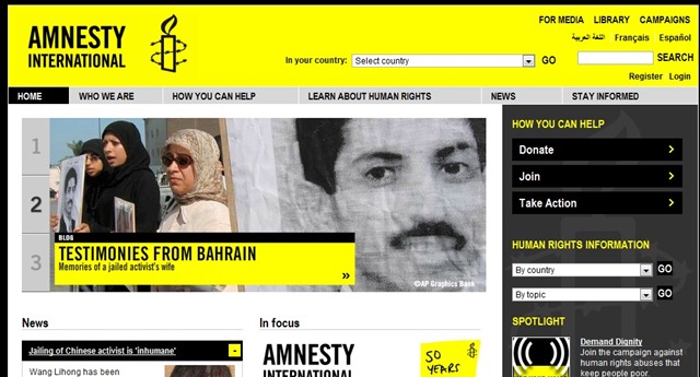
The Amnesty International site makes great use of color, including a bright yellow header and accents mixed with shades of gray and black. A slideshow on the home page shows current news and research. Links to join, donate, or take other action are featured prominently in the sidebar and a link to media information is included in the header.
References and Tutorials:
1. The Most Effective Online Donation Page Ever
2. Paypal Custom and Donation Forms
3. Donation Page Optimization Basics
4. Increasing Online Giving: 10 Tips to Optimize Your Donation Landing Pages
5. How To – Create A Donation Page for WordPress
Dustin Betonio is a Translation Management graduate at University of Mindanao. His earlier career was devoted on customer service outside the information highway. Currently studying Law in the same University.


Awesome Post. Liked it 😀
Great examples! Not too cluttered and easy on the eye.