
Typically navigation menus follow the content and move up when the page is scrolled just to disappear.
While this is pretty much seen all over the Internet some site use fixed position for their navigation. This may be good for user experience as the main navigation is always available. Another possible use and upcoming trend for fixed positioning is notifications bars.
As these stay at the top, the bottom or fixed in one of the sides they can be great for picking up social likes, mail signups, flashing a new product etc. Let have a look at how you can add your own fixed elements to your site. I’m going to use a navigation menu as example but this should work with other layout blocks as well. If you are building a new site another option is also to find ready made navigation solutions e.g. some jQuery Menu Plugins
[exec]$filestr = file_get_contents(‘http://www.tripwiremagazine.com/googleadsensebelowmoretag.inc’);echo $filestr;[/exec]
For this Coding tip I used the html5 template from html5boilerplate.com. This is mainly to get started faster and also to show you this framework is worth considering for quick mockups and of course for professional html based web pages. Much better than starting from scratch every time…
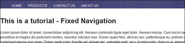
Further I will just use a simple HTML list structure for the navigation. To make it HTML5-ish I’ll wrap it in a <nav> tag… as it is a navigation manu we are building. No matter what tag you use (could be a div tag as well) it needs to be placed in a fixed position in order to remain a contant element. I’m adding this code and a lot of dummy text to the index.html in the root directory of boilerplate.
<nav>

<ul>

<li>HOME</li>

<li>PRODUCTS</li>

<li>CONTACT US</li>

<li>ABOUT US</li>

</ul>

</nav>
How to FIX the nav / div tag
With CSS it is very simple to fix an element. You simply use the position: fixed property. The code below I added to /css/style.css. In order to make the transparent background you can simply make a png image with layer opacity e.g. at 80% (asuming you use Photoshop).
/* =============================================================================

Navigation

========================================================================== */
nav{

background: url("../img/nav-bar.png") repeat-x;

height:    40px;

width: 960px;

position: fixed;

}
nav ul {

list-style: none;

}
nav ul li {

float: left;

margin: 0 14px;
}
Fix placement of main content with Padding
At this point the navigation and the dummy text is placed behind the navigation – all messed up – and we need some padding around the main content area. This is how position:fixed work.
In boilerplate index.html I added id=”maincontent” to the div tag used to contain the main content. This is to have a easy selector for the CSS code.

Now adding this CSS makes sure the content and the navigation have same width and more importantly that the main content is pushed down a bit. Make sure the value for padding-top is larger than the height set for the navigation.
/* =============================================================================

Main Content

========================================================================== */
#maincontent {

width: 960;

padding-top: 55px;

}
Now when you load the page the navigation and main content is not placed on top of each other.

Fix placement of main content with Margin
Another way to get the same result is to use margin instead of padding. There is however a small warning here. Margin-top may cause the nav element to move down the page. A float: left on the main content block will however fix this. This is how it looks without it.

/* =============================================================================

Main Content

========================================================================== */
#maincontent {

width: 960px;

margin-top: 55px;

float:    left;}
This is all for todays CODE Tip. Check out the demo here. You can also download the files here.
Examples of sites with fixed navigation
thelounge
The Lounge is cool I think because there is a clean design seperation between the content and the fixed navigation. Further it look cool when you scrool as the background on the right moved with the text on the left.

Raise The Roof
This site is a great example of how fixed navigation can be used as a design element. The cloudy illustration is used as background and have an un-even transition between content and navigation.

When looking at this png in Photoshop you can see the transparent areas. Simple trick – but very powerful and good looking!

slv-rent.be
SLV use a fixed whitw navigation with a bit of transparency giving a gradien effect. This is one way of designing the transition between the content and the navigation.

Full Stop
This site have a transparent fixed navigation menu. It is also a one page design meaning that if a menu link is clicked the page will scroll down and not load a new page Cool site!

Nudge
This is also a one page design website with a cool fixed menu.

On some areas of the page the background fully match the navigation.

Studiochirpy
This is an example of a floating logo and navigation area. Some would argue the design is not perfect bacause the fixed area take too much space over the fold.

Lars is passionate about web design, web development, SEO, social media and loves to look into new technologies, techniques, tools etc. and to write articles for tripwire magazine readers.


Excellent, well-written tutorial and an inspiring set of examples. I just used this guide to create a semi-transparent fixed nav for my site and it’s a welcome change. Thanks Lars.
Nice tutorial! I’m just starting out with learning how to do a fixed navigation and your examples make it tons easier. thanks again! My site here http://watchmanadvisors.com has fixed navigation built into it for wordpress but i was trying to figure how to do this on my own.
Great article and one that has made me think about how I approach my future designs. This is an area I have been thinking about for a little while now and an aspect I am considering more and more. This is especially the case with things like social media and with how important this area is becoming, using this fixed position idea can help in getting across things like news and social media links. You have put together some great examples and I thought the tutorial you put in was very useful. Great article and thanks for the tutorial.
Thanks for your article.
As you might know ‘position: fixed’ doesn’t work on mobiles.
Do you happen to know a workaround?