

25+ Best WordPress eCommerce Themes – Time To Improve Your Webshop?
The quality and availability of WordPress e-commerce themes makes WordPress a serious choice as an online shop platform. In fact, WordPress has moved rapidly from being mainly a blogging platform and is now one of the top CMS systems for traditional websites. Lately,...
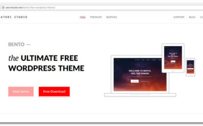
Top 100 Websites To Find The Best Free WordPress Themes
Welcome to our Website Awards for best free WordPress themes. We are hosting this award to showcase the best websites to visit when you're looking for a free WordPress theme. The level of quality, design and creativity on the nominated websites is amazing. It is a...
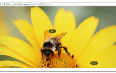
10+ jQuery Image Zoom Effect Plugins
With jQuery image zoom effect plugins, you can create amazing image zoom effects with minimal coding effort. This is very useful if you have large images that will otherwise take up too much space on your web pages. With a jQuery zoom script you can keep the image...
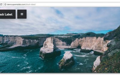
30 Best Fullscreen WordPress Themes The Ultimate Collection
A dedicated fullscreen WordPress theme is a powerful way to catch your visitors attention. Like WordPress themes for portfolio websites they are great for showcasing your work as a photographer, creative artist, designer or photojournalist. The use of the entire...

15+ Responsive WordPress News Themes To Impress Your Readers in 2017
In this article I have collected some of the best WordPress news themes to help you get started building a cool news website! One of the most disruptive trends right now is the move from reading printed to checking short news updates online. It is common that users...

15+ Photo WordPress Themes For Showcasing Your Best Work in 2017
So, in this post we showcase a bunch of photo WordPress themes perfect for anyone who works in the photography field. Whether you are a photographer and looking for something to help you make your online portfolio or own a photography studio and want to put up a...
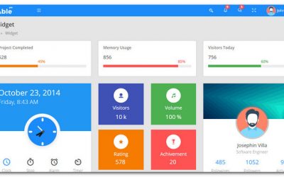
15+ Brilliant Admin Panel Template Designs Based On Twitter Bootstrap
In this article you will find an up-to-date collection of powerful admin panel template designs based on Twitter Bootstrap. Bootstrap has become a quite popular collection of free HTML and CSS-based web development tools. It is a responsive framework based on design...

14 Amazing Restaurant Menu Templates For WordPress For 2017 – Want More Customers?
Restaurant Menu Templates for WordPress are popular these days. Restaurants, cafes, bars and coffee shops create websites and a menus for their businesses. WordPress is a popular platform which provide a rock solid solution for this purpose. WordPress is an easy to...

20 Best Prestashop Templates For 2017 – Want A SEO Friendly Ecommerce Site?
In this article, we showcase the best Prestashop Templates created or updated in 2017. What do people say about your Eccommerce site when you’re not around? Hopefully they love your website. If not it can hurt your chances of being successful. It makes a huge...


