
Most people would agree that the old adage “A picture is worth a thousand words” is also true for web based solutions.
There should be no discussion – Charts and Graphs are ideal to visualize data in order to quickly deliver an overview and communicate key messages. Whatever type of data presentation you prefer or suits you data (pie charts, bubble charts, bar graphs, network diagrams etc.), there are many different options but how do you get started and what is technologically possible?
In this article tripwire magazine present more than 75 Tools for Visualizing your data on a website and most of the options available will be covered. If you are aware of a tool, script etc. that deserves to be added to the list I would kindly ask you to leave a comment to everyone’s benefit.
[exec]$filestr = file_get_contents(‘http://www.tripwiremagazine.com/googleadsensebelowmoretag.inc’);
echo $filestr;[/exec]
Introduction
Images says more than a thousands words. It is common sense and wise people has followed this rule for centuries by creating illustrations of thier ideas and thoughts. Today it is easier than ever as the technology for presenting nearly any type of information as a graph or chart on a web page is getting really mature. Reading through this article you will be faced with the problem on what technology and specific implementation you should use. It is not a trivial question and I recommend that you use comments on this article to share your ideas, concerns etc. with peer readers. This way you may get the input from the community that you need to create the optimal solution.
The article has been organised into the following sections.
- Section 1: How to visualize you data using Javascript-based solutions
- Section 2: How to visualize you data using CSS
- Section 3: How to visualize you data using Server-side Solutions
- Section 4: How to visualize you data using FLASH-based solutions
- Section 5: How to visualize you data using Online Tools and Services
How to visualize you data using JavaScript-based solutions
In this section you will find JavaScript-based solutions for adding graphs of nearly any kind to your website. If you do not want to draw your data in real time and want to present them as images I recommend you use some sliders or banner rotators based on jQuery.
jqPlot Charts and Graphs for jQuery
The feature rich jqPlot is a plotting and charting plugin for the jQuery Javascript framework. There are plenty of hooks into the core jqPlot code allowing for custom event handlers, creation of new plot types and adding canvases to the plot.

flot – Attractive Javascript plotting for jQuery
Flot is a pure Javascript plotting library for jQuery. It produces graphical plots of arbitrary datasets on-the-fly client-side. It has been developed with focus on simple usage (all settings are optional), attractive looks and interactive features like zooming and mouse tracking.
The plugin works with Internet Explorer 6/7/8, Firefox 2.x+, Safari 3.0+, Opera 9.5+ and Konqueror 4.x+ with the HTML canvas tag (Internet Explorer where the excanvas Javascript emulation helper is used).

jQuery Sparklines
This jQuery plugin generates sparklines (small inline charts) directly in the browser using data supplied either inline in the HTML, or via javascript all with a single line of code.
The plugin is compatible with most modern browsers and has been tested with Firefox 2+, Safari 3+, Opera 9, Google Chrome and Internet Explorer 6, 7 & 8.

Flotr Javascript Plotting Library
Flotr is a javascript plotting library based on the Prototype Javascript Framework and has been inspired by Flot (above).
Flotr enables you to draw appealing graphs in most modern browsers with an easy to learn syntax. It comes with great features like legend support, negative value support, mouse tracking, selection support, zoom support, event hooks, CSS styling support and much more.

jQuery Visualize Plugin – Accessible Charts & Graphs
The jQuery Visualize Plugin makes use of the Canvas element of HTML5 to give you a simple and accessible method for generating bar, line, area, and pie charts from data contained within an HTML table and allows you to configure them in a variety of ways.

MilkChart – Graph/Chart library for MooTools
MilkChart is a simple to use, yet robust library for transforming table data into a chart. This library uses the HTML5 <canvas> tag and is only supported on browsers other than IE until ExCanvas gets proper text support.

Protovis – A graphical approach to visualization
Unlike low-level graphics libraries, Protovis, defines marks through dynamic properties that encode data, allowing inheritance, scales and layouts to create data with simple marks such as bars and dots to simplify construction.
It uses JavaScript and SVG for web-native visualizations; no plugin is required (though you will need a modern web browser) and programming experience is helpful but not essential. It does have extensive documentation and a wide array of examples on its homepage to help you get started.

mooCSSChart
With mooCSSChart you can easily create animated bar charts.

TufteGraph
Tuftegraph sells itself as “pretty bar graphs that you would show your mother”. It comes close, Flot is prettier, but Tufte does lend itself to be very lightweight. Although with that comes restrictions – there are few options to choose from, so you get what you’re given. Check it out for a quick win bar chart.

jQuery + Flot – Plots, Canvas and Charts

Create a jQuery Graph Plugin

JS Charts
JS Charts is a free JavaScript based chart generator that requires little or no coding. With JS Charts drawing charts is a simple and easy task, since you only have to use client-side scripting (i.e. performed by your web browser). No additional plugins or server modules are required. Just include our scripts, prepare your chart data in XML or JavaScript Array and your chart is ready!

PlotKit – Javascript Chart Plotting
PlotKit is an experimental JavaScript-based chart and graph plotting library. It has support for HTML Canvas and SVG via Adobe SVG Viewer as well as native browser support. The script requires MochiKit JavaScript library, version 1.3 or higher. Released under the BSD License.

Highcharts – Interactive JavaScript charts for your webpage
Highcharts is a charting library written in pure JavaScript, offering an easy way of adding interactive charts to your web site or web application. Highcharts currently supports line, spline, area, areaspline, column, bar, pie and scatter chart types.
It works in all modern browsers including the iPhone and Internet Explorer from version 6. Standard browsers use the Canvas element and in some cases SVG for the graphics rendering. In Internet Explorer graphics are drawn using VML.

Emprise JavaScript Charts
Emprise JavaScript Charts is done in pure JavaScript — no Flash support is required. The script includes features such as hints, mouse tracking, mouse events, key tracking and events, zooming, scrolling, and crosshairs which might raise interactivity and user experience. EJSChart supports XML-formatted data.
Every aspect of the charting display can be configured and customized through well-documented properties and methods. An interesting solution, offering a number of designs and behaviours. Pricing starts at $100.00. There is a watermarked private version available for free.

Plotr
This lightweight charting framework based on PlotKit draws simple charts. It’s free, and there is no use of Flash. There are also no interactive elements, however you don’t always need them.

How to visualize you data using CSS
Flexible Bar graphs using css
This article covers creating bar graphs using css.

Pure Css Horizontal Bar graphs
This article covers tutorial on creating Pure css Horizontal bar graph.

Creating a Bar Graph using CSS and PHP
Richard Clark created this vertical bar graphs with css and php, a must see tutorial.

A definition list bar chart

Pure Css Line Graph
My intention was not only to enable data visualization to people that don’t feel comfortable with using various scripting languages but also to demonstrate the power of css and present a way of using css a bit differently.

Line Graph script
This is a purely DHTML/ CSS based Line Graph script. It loads fast and blends in with the rest of the page. You can even use a transparent background for it!

Pie Graph script
This is a purely DHTML/ CSS based Pie Graph script. It loads fast and blends in with the rest of the page. You can even use a transparent background for it!

Dynamic Pie Chart with CSS

DHTML / CSS based bar graph
This vertical bar graph is done completely using DHTML and CSS! Unlike an applet based solution, this loads fast and blends in with the rest of the page. You can even use a transparent background for it!

DHTML / CSS based line graph
This line graph is done completely using DHTML and CSS! Unlike an applet based solution, this loads fast and blends in with the rest of the page. You can even use a transparent background for it!

PHP and CSS- A Simple Graph
Here’s an easy way to display a simple percentage graph using PHP to work out the percentages and do the maths and CSS to display the data on our page.

Demo : View the demo.
Accessible Data Visualization with Web Standards
Author Wilson Miner discusses the concept of accessible, standards-compliant techniques for data visualization mentioning the benefits, limitations, and alternatives in brief. The A List Apart article shows you three data visualization techniques using a basic structure of unordered lists.

View Demo #1 – View Demo #2 – View Demo #3
AjaxMGraph
Ajax Graph based on Prototype.js. A very nice interactive graph script.

Vertical Bar Graphs using CSS and PHP
Who wants to use Excel to make a new graph each week? Using CSS and PHP you can create attractive bar graphs that are always up to date.

Demo : View the demo.
CSS Vertical Bar Graphs
Eric Meyer shows us another technique for graphing vertical bar graphs using unordered lists.

Creating a Graph Using Percentage Background Images
In this technique, you use pre-made background images to shade in the appropriate data. The downside of this technique is that you’re limited by the pre-filled background images that you have and making more to suit your needs will increase the amount of classes you assign to your data – increasing the file size of both your CSS and HTML file as well as increasing the number of HTTP connections needed to render the page because of the background images

CSS Scatter Plot
A scatter plot is another great way to graph two-dimensional data. In the example, each data point is clickable, so a possible modification to this technique is to use a modal window that displays extra information about a particular data point.

Definition List Bar Chart
This technique shows two examples of styling definition lists into horizontal bar charts. Each definition list item is assigned a class that adjusts its width using percentage units.

Pure CSS/HTML Bullet Graph

Demo: View the demo.
Silo graph for material level
This article describes how to display material level in silo (bunker). Two pictures are pepared for this type of graph. First one is picture for level of material, similar to pictures in other bar graphs. The second picture is outline contour of bunker. This is transparent .gif, which has two white colors. One opaque white is used for outer space of contour, second white color, with another index of colors, is for inner part of bunker and for this color full transparency is set up.

Sandwich graph
For drawing sandwich graph, several pictures are needed. Background graph picture includes scale lines and dark gray part for legend. Part of background can be also description of scale, if worsen quality at printing admitted.
It is possible to experiment with bar images. There is only one limitation, bar must be symetrical in one axis. For vertical bar graph balancing in horizontal axis is required.
It proved to me the minimal height of bar image 16 pixels. Images less then 8 pixels, when magnified more than 10 times in one axis, sometime disappears. But it was many years ago in old browser.

Production plan graph
Entire graph is allocated into block which has style position: relative attached. This block is container for graph drawing, inside of this block another graphic elements with assigned style position: absolute can be placed.

Accessible Bar Chart
This technique showcases a method for semantic, accessible bar charts by using a table as the basic structure of the bar graph and using CSS to stretch a background image to its appropriate width.

Simple bar graph with help of CSS

Real time bar graph by help of AJAX and CSS
Here is live demo of dynamic CSS bar graph, which reads data from web server by help of Ajax functions, description of HTML, CSS and JavaScript code for data transmition, data representation and graph sliding. Graph displays response time of ping executed by web server.

Downtime graph
Graph example here is cut short by legend, by links to daily report printing, by links to detail description of downtime and by navigation for month and production line selecting. To preserve some dynamic of graph function onMouseOver() is kept running. Instead of legend, short explanation: green marks technological downtime, orange marks maintenance downtime, blue is job change, white means that production line is not used, dark gray is for all others types of downtime events.

How to visualize you data using Server-side Solutions
YUI 2: SWF Charts
The YUI Charts Control visualizes tabular data on a web page in several possible formats including vertical columns, horizontal bars, lines, and pies. Notable features include support for the DataSource Utility, customizable series and axes, a customizable mouse-over datatip, combination charts, and skinning.

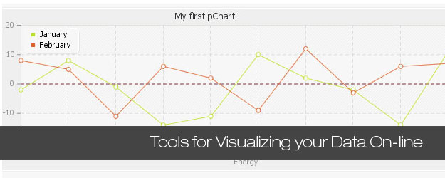
pChart – a PHP Charting library
pChart is a PHP class oriented framework designed to create aliased charts with its data easily retrieved from SQL queries, CSV files, or manually provided. In this version rendering speeds have been greatly improved and run pChart on your web server, you’ll need to use PHP compiled with the GD library support.

Gruff Graphs for Ruby
The Gruff Graphing Library is a project to make beautiful graphs with Ruby. Can be used alone or with Ruby on Rails.

Image_Graph
Image_Graph (formerly known as GraPHPite) utilizes PHP’s object oriented model to enable users/developers to create highly versatile graphs in a simple way. There are 14 highly customizable chart types including line, bar, area, pie, impulse, dot/scatter, step, candlestick, box & whisker, radar, etc.
The free script requires PHP4 or PHP5 support with GD 2 support for optimal performance and PEAR package, including Image_Color and Image_Canvas package. The site offers over 80 samples of how the tool can be used.

.netCHARTING
.netCHARTING utilizes the .NET framework and GDI+ providing a managed charting solution for C# and VB.NET developers working with ASP.NET or WinForms. The tool offers a huge choice of available charts. In most cases 2D and 3D-views are available. Price range starts at $395 for a single site license.

Libchart
Libchart is is a simple PHP-library. You can create Line-, Bar- (horizontal and vertical) and Piecharts. The tool requires PHP compiled with GD Graphics Library and FreeType. Libchart is a free software distributed under the terms of the GNU General Public License (GPL).

JpGraph
JpGraph is a Object-Oriented Graph creating library for PHP. The library is completely written in PHP and can be used in any PHP scripts. The library can be used to create numerous types of graphs either on-line or written to a file. Line plots, filled line plots, step line plots, bar and pie charts, ring and scatter plots, polar and canvas plots as well as Gantt Charts. The designs of charts aren’t that impressive, but they don’t have to.

How to visualize you data using FLASH-based solutions (and Silverlight)
Visifire – Silverlight and WPF Chart Controls
Visifire is a set of open source data visualization controls – powered by Microsoft Silverlight. it is a multi-targeting control which can be used in both WPF and Silverlight applications, that can be used with ASP, ASP.Net, PHP, JSP, ColdFusion, Python, Ruby or just simple HTML.

Open Flash Chart
Open Flash Chart works by requesting data from the server when a user loads a web page. The server will knows who the particular user is and it will generate a custom chart showing up to the minute data.
You will need to include the Open Flash Chart in your HTML, and you also need to provide the data file on the server. The data file is either a text file, or a .php, Perl, Python, Java (or another flavour of dynamic) page.

Bluff Graphs
Simple to use and with great built in options to make charts on any site a quick reality
Chart Types: Accumulator, Area, Bar, Line, Mini Bar, Mini Pie, Mini Sidebar, Pie, Net, Sidebar, Spider, Stacked

FusionCharts Free
FusionCharts Free is a flash charting component that can be used to render data-driven & animated charts for your web applications and presentations.
It is a cross-browser and cross-platform solution that can be used with PHP, Python, Ruby on Rails, ASP, ASP.NET, JSP, ColdFusion, simple HTML pages or even PowerPoint Presentations to deliver interactive and powerful flash charts. You do NOT need to know anything about Flash to use FusionCharts. All you need to know is the language you’re programming in.

amCharts
mCharts offers a flexible and easily customizable solution for generating charts “on the fly”. There are 4 sets with predefined Pie & Donut, Line & Area, Column & Bar and Scatter & Bubble. Generated Flash-files are dynamic and can be presented in 2D or 3D. The loader can load data from XML or CSV, so you can easily export data from Excel, dynamically generate data file with PHP, ASP, .NET or other programming language. Some flash-charts also have animation effects. amCharts is linkware which means that you have to place a link to the source if you’d like to use it for free. You can also purchase a single site license for 85 Euros (~$117).

Flare
Flare is an ActionScript library for creating visualizations that run in the Adobe Flash Player. From basic charts and graphs to complex interactive graphics, the toolkit supports data management, visual encoding, animation, and interaction techniques. Even better, flare features a modular design that lets developers create customized visualization techniques without having to reinvent the wheel.

Open Flash Chart (OFC)
OFC is an open-source project. The Flash chart offers 35 chart variations; among them a number of bar charts, pie charts and line charts. Provided tutorials explain how the script can be extended with further functionality such as mouse-over effects and how the database can be queried for some values and the results then displayed in a graph. Open Flash Chart uses Flash and PHP; data can be stored in plain text (.txt). The package, available via Sourceforge, includes a number of examples and samples.

AnyChart Flash Chart Component
AnyChart is a more powerful alternative to Open Flash Chart. It is fully cross-browser and cross-platform and can generate Pie, Bar, Line, Candlestick, Area, Column, Bubble, Spline, Dot/Marker, Scatter, Candlestick and Doughnut charts. It can be used with virtually all scripting languages — ASP.NET, ASP, PHP, JSP, ColdFusion, Ruby on Rails, simple HTML pages and also PowerPoint presentations.
AnyCharts is driven by XML as universal data interface, so you can visualize data from any data format: from files in text, Excel, CSV formats to MySQL, MS SQL, and Oracle database servers. Users can save the generated charts as an image for email sending or chart export. AnyChart is huge, but not that inexpensive – a one developer licence starts at $649.00.

XML/SWF Charts
PHP/SWF Charts offers a simple and dynamic solution for interactive Flash-based charts. Columns, circles, bars and pies can be displayed in 3D. You create an XML source to describe a chart, then pass it to this tool’s flash file to generate the chart. The XML source can be prepared manually, or generated dynamically using any scripting language (PHP, ASP, CFML, Perl, etc.).
The script requires only PHP 4 support; it is free, however all charts are by default linked to the source — unless you’ve purchased a license.

Swiff Chart Generator
Swiff Chart Generator is the server-side solution to dynamically serve eye-catching animated charts from Active Server Pages (ASP), PHP scripts or JSP scripts. Query data from a database, apply your own style template created with the Swiff Chart authoring tool and Swiff Chart Generator instantly generates high-impact charts in Flash format, PNG/JPG format, SVG format and PDF format. Use Swiff Point Player to incorporate your Flash Charts into your PowerPoint presentations. Pricing starts at $149.

Rich Chart Server for .NET
Rich Chart Server generates captivating interactive Flash charts from ASP.NET and Windows Forms applications. Rich Chart Server uses flexible templates to integrate dynamic content from a variety of data sources. Price $295.

Flash Charts Pro
Flash Carts Pro — ASP Chart and PHP Flash Charting tool — comes with 9 main categories and more than 30 chart types. No installation is required. Upload the Flash file and generate a list of ingoing values – or use a script. Customization is possible via the XML file itself. The tool offers multi-lingual (UTF-8) characters support, customizable animation, grid component and dynamically resizable charts. The price range starts at $59. Unfortunately there is no trial-version.

How to visualize you data using Online Tools and Services
iCharts
iCharts allows everyone to upload Excel sheets or manually add data from which they can easily create, share and embed interactive charts within minutes. iCharts can be published on the iCharts Portal at iCharts and they can be embedded anywhere on the Internet in blogs, forums or corporate websites.

ChartGo
ChartGo is an online generator that allow users to create charts online quickly. You can create bar charts, line charts or pie charts and you simply paste your data in the chart data area and hit the create chart button.

Chartle.net – Interactive Charts Online
Chartle is a very easy to use and completely free online chart generator that allows you to embed and share your plots, maps, charts, diagrams and business reports online.
Chartlet is non-binding towards its users, there is no forced registration and all generated charts are your own, The only thing they ask is that you link back to them.

Flexible Online Chart Generator
There are a lot of chart types supported like bar charts, pie charts, line charts, bubble charts and radar plots. The charts can be downloaded as image formats like PNG and JPEG and other formats like PDF and CSV.

Google Chart API
The Google Chart API lets you dynamically generate charts. To see the Chart API in action, open up a browser window and copy the following URL into the address bar:
http://chart.apis.google.com/chart?cht=p3&chd=t:60,40&chs=250x100&chl=Hello|World

Rich Chart Live
Rich Chart live offers a number of templates and styles. The image below shows the “watercolor pie”-style. Output: Flash-, PowerPoint or image you can insert in your weblog instantly.

FusionCharts Google Gadget
The online-version of Fusioncharts.

Create a Graph
Supposed to be used by kids, this tool offers a variety of different charts which can be generated once the data is provided. Flash is required.

Lars started tripwire magazine back in January 2009. He is really passionate about web design, web development and loves to look into new technologies, techniques, tools etc. and to write articles for his readers.


Has anyone seen a solid javascript based charting package that has surface or contour charts? I have been searching forever and come up with nothing.
Awesome resource, lots of useful information and all of it so clean, this will help me alot. W ill certainly share it. Thanks!
Tools for Visualizing your Data, CSS, Flash, jQuery, PHP
[…] 4. 75+ Tools for Visualizing your Data, CSS, Flash, jQuery, PHP – http://www.tripwiremagazine.com/2009/12/70-tools-for-visualizing-your-data-css-flash-jquery-php.html […]
[…] Olivera, Software Engineer(LAMP, Zend Framewor… There are quiet a few mentioned here http://www.tripwiremagazine.com/…Insert a dynamic date hereView All 0 CommentsCannot add comment at this […]
If you are a software developer programming in .NET and Silverlight, ActiveAnalysis by GrapeCity allows you to embed rich, interactive OLAP and data visualization features into your applications without writing a single line of code. Plus you can customize the user experience using standard programming techniques.
http://www.datadynamics.com/Products/ActiveAnalysis
http://www.datadynamics.com/Products/ActiveAnalysis/Gallery.aspx
With support for all three development platforms and zero run-time royalties, ActiveAnalysis is a pretty complete component solution, and probably the industry’s best value for anything to do with OLAP, data visualization and business intelligence development in .NET.
I want to suggest a data visualization software named Visual Fusion. Visual Fusion is a product by IDV Solutions. IDV is a Microsoft Gold Certified Partner and uses bing maps in Visual Fusion.
http://www.idvsolutions.com/demos_videos.aspx
http://www.idvsolutions.com/
[…] Shared 75+ Tools for Visualizing your Data, CSS, Flash, jQuery, PHP — tripwire magazine. […]
[…] Neki frejmvorci uklju?uju grafikone kao npr. Ext JS, Flex, Telerik, i SmartClient. Ali postoje i Flash biblioteke koje se koriste upravo za ovaj vid prikaza statisti?kih podataka. Popularne biblioteke su AnyChart, Dundas, JFreeChart, amCharts, Visifire for Silverlight. Liste ovakvih biblioteka su dostupne online: 28 on InsideRIA i 70+ on TripWire. […]
Theres also gflot. An flot adaption for gwt:
http://code.google.com/p/gflot/
Thank you for the article. I’d like to add one more powerful flash-based solution. Take a look at it here: http://www.flycharts.net
[…] For Mobile devices that allow Flash, I would suggest browsing through these lists: 28 Rich Data Visualization Tools List of Data Visualization Tools 75+ Tools for Visualizing your Data, CSS, Flash, jQuery, PHP […]
[…] For Mobile devices that allow Flash, I would suggest browsing through these lists: 28 Rich Data Visualization Tools List of Data Visualization Tools 75+ Tools for Visualizing your Data, CSS, Flash, jQuery, PHP […]
[…] Go here to see the original: 75+ Tools for Visualizing your Data, CSS, Flash, jQuery, PHP … […]
Social comments and analytics for this post…
This post was mentioned on Twitter by gridlockd: “75+ Tools for Visualizing your Data, CSS, Flash, jQuery, PHP” http://is.gd/5hIlA #Web #Design #jQuery #PHP #Flash #CSS…
Wow, how could you did this man ,This is superb one,I really appreciated from that,and I will bookmark it,This is about ” 75+ Tools for Visualizing your Data, CSS, Flash, jQuery, PHP “,Its awesome,
Thanks for sharing,
[…] amCharts, Visifire for Silverlight. Lists of chart libraries are available: 28 on InsideRIA, and 70+ on TripWire. See ‘Sparklines’ for micro-charts.Collapsible Panels Inlay panel on the BBCLots of […]
[…] 75+ Tools for Visualizing your Data, CSS, Flash, jQuery, PHP (9 decembrie) […]
[…] are many ways to communicate data visually. Count them: 13, 20, 28, 75… and many […]
I would like to suggest you also our new software “Grapheur” (www.grapheur.com) for graph visualization and data mining. I would be very proud if you can try it in your web site.
Feel free to contact me for every question or anything else!
[…] 75+ Tools zur Visualisierung von Daten Nicht zuletzt durch ExtJS nähert sich die Backend-Programmierung immer mehr den Desktop-Programmen an. Ein wichtiger Aspekt dabei ist immer mehr die Visualisierung von Daten. Unter dem angegebenen Link findet ihr eine Sammlung von 75 Libraries und Klassen um nette Diagramme zu erstellen. […]
[…] de ce qui se fait tant au point JS que PHP/Flash, voici un petit lien qui devrait vous plaire Tools for visualizing your data. […]
I have the pleasure to brief on our Data Visualization software “Trend Compass”. TC is a new concept in viewing statistics and trends in an animated way by displaying 5 axis (X, Y, Time, Bubble size & Bubble color) instead of just the traditional X and Y axis. It could be used in analysis, research, presentation etc. In the banking sector, we have Deutsche Bank New York as a client. This a link on weather data : http://www.epicsyst.com/test/v2/aims/ This is a bank link to compare Deposits, Withdrawals and numbers of Customers for different branches over time ( all in 1… Read more »
This is really very big list. I haven’t see many in this list, have to check out soon.
My favorite is Open Flash Chart 2
Check this demo i made for Open Flash chart http://demo.webasp.com.au/ofc-explorer-k.html hope you like it.
[…] and easy task, since you only have to use client-side scripting (i.e. Follow this link: 75+ Tools for Visualizing your Data, CSS, Flash, jQuery, PHP … Share and […]
[…] 75+ Tools for Visualizing your Data, CSS, Flash, jQuery, PHP | tripwire magazine. Related News & Resources Chart Comparing Data Visualization Tools Visualizing Data […]
There is mistake: Bluff charts are javascript/canvas based, non-flash charts
[…] 75+ Tools for Visualizing your Data, CSS, Flash, jQuery, PHP … Share and […]
You might also want to have a look at FusionCharts for Dreamweaver extension – it creates animated Web charts from the Dreamweaver Interface.
[…] 75+ Tools for Visualizing your Data, CSS, Flash, jQuery, PHP | tripwire magazine – […]
[…] 75+ Tools for Visualizing your Data, CSS, Flash, jQuery, PHP Submitted by Nirhana […]
[…] 75+ Tools for Visualizing your Data, CSS, Flash, jQuery, PHP … By admin | category: page view | tags: california, data, easy-way, japanese, myspace, page […]
[…] This post was mentioned on Twitter by bkmacdaddy designs, WPstudios, John McBride, Goo Goo, Denise Sarpong and others. Denise Sarpong said: RT @wpstudios: RT @bkmacdaddy 75+ Tools for Visualizing your Data, CSS, Flash, jQuery, PHP – http://bit.ly/8BDemU […]
Thanks a bunch! It’s Dynamic Web Charts, a Dreamweaver extension which allows you to create Flash based charts using manually entered or dynamic data, you can check it out here http://bit.ly/5ePZlK
[…] 75+ Tools for Visualizing your Data, CSS, Flash, jQuery, PHP … By admin | category: silverlight tools | tags: 2010-usually, asp, control-which, […]
[…] More: 75+ Tools for Visualizing your Data, CSS, Flash, jQuery, PHP … […]
Super thorough list, thanks for sharing! My company has another great Flash based resource, would it be alright if I share it here?
@Jon, Sure what is it?
[…] See original here: 75+ Tools for Visualizing your Data, CSS, Flash, jQuery, PHP … […]
[…] more here: 75+ Tools for Visualizing your Data, CSS, Flash, jQuery, PHP … By admin | category: php scripts, scripts | tags: active, active-server, jsp, own-style, […]
[…] here to see the original: 75+ Tools for Visualizing your Data, CSS, Flash, jQuery, PHP … […]
[…] This post was mentioned on Twitter by Louis Gubitosi, tripwire magazine, Blueprint DesignBlog, Meng To, Web Design Feed and others. Web Design Feed said: 70 + Tools for Visualizing your Data, CSS, Flash, jQuery, PHP: Most people would agree that the old adage “A pic… http://bit.ly/59iziS […]